Getting Started
ReportPlus is a self-service business intelligence tool that puts the power in your hands to do dashboard reporting - all without the need for custom programming. With ReportPlus Web, you can view dashboards in your browser, easily query and filter enterprise data sources and enjoy meaningful visualization over data.
Dashboard Selector
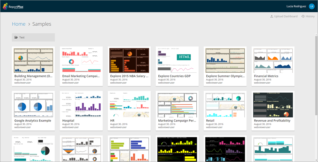
When you first open ReportPlus, you are greeted by a dashboard selector which gives you the ability to:
- Open saved dashboards. These are the ones displayed as thumbnails in the initial view, and you open them by clicking on the corresponding thumbnail image.
- Add a New Folder to store and organize your dashboards.
- Upload a dashboard. Add a new dashboard to your Web repository.
- Access the History for your ReportPlus Web account. This will show you dashboards that you have added and deleted from the platform, and will also allow you to restore deleted dashboards.
Opening & Navigating Dashboards
You can open existing dashboards by clicking on the dashboard thumbnail image in the initial view.
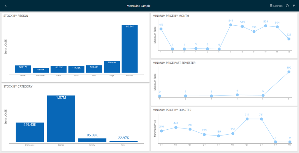
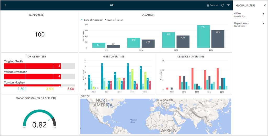
A dashboard is composed by a tile of visual blocks called widgets. Each widget is meant to display a different piece of related information, allowing you to communicate insights at a glance. This dashboard-widget structure allows you to better digest the bigger picture in your business.
It's possible to maximize any of the dashboard widgets just by clicking it.
The maximized view not only allows a larger display of the information, but also enables some interactions. For instance, the grid view supports horizontal and vertical scrolling, and the chart view supports zooming and panning.
Depending on the definition of the dashboard, it might be possible to filter information at a widget or a dashboard level.
For more information on Dashboard Filters and Binding, check out this section.
Importing Dashboards with new Data Sources
ReportPlus' cross-platform compatibility means that you can also import dashboards from different platforms into Web. The data sources linked to the dashboard do not need to be added in Web before the dashboard is imported; they can be added during the import process.
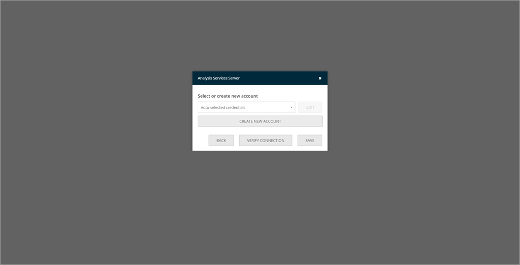
For example, let's import a pre-existing Analysis Services dashboard from our local storage into into ReportPlus. Once the dashboard is opened within ReportPlus, the following message will appear.
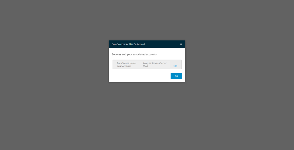
When you click Edit, you will see a new dialog pop up prompting you to select or create a new account for your data source. All other information is already picked up by ReportPlus Web (for Analysis Services Server, this includes Connection Mode, Server Name and Port).
Once the information is entered, the dashboard will be displayed.
Data Visualizations
In order for users to get the all possible insights out of their business data, ReportPlus provides several options to customize the way information is visualized. This document will outline the visualizations you will see in Web.
Grid View
The grid view is the default visualization option for displaying data and it presents the information in a matrix.
Note: The grid view is suitable in a dashboard when the number of rows, and columns is less than 10. When you're dealing with small amounts of data, the preferred approach may be to "just show the numbers".
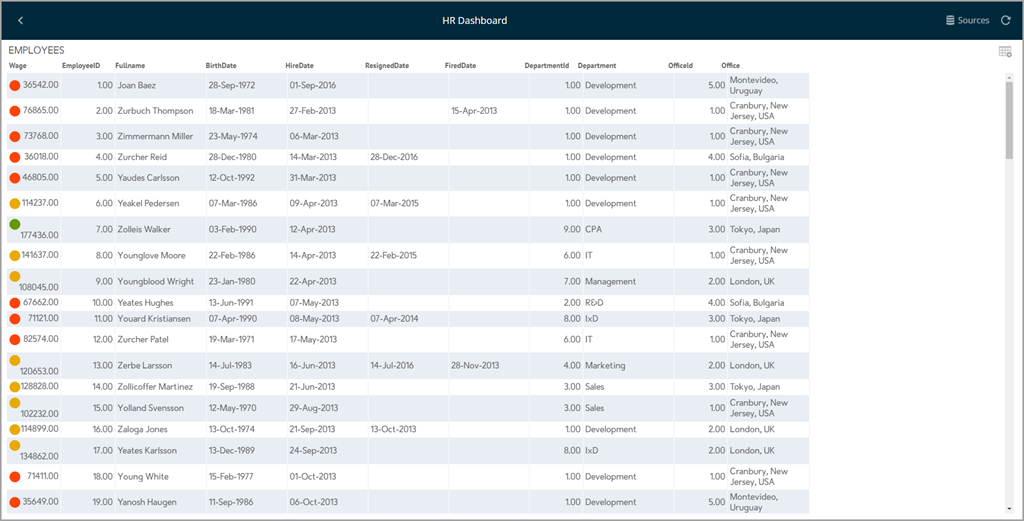
Conditional Formatting
The grid view, among other views, allows you to provide different formatting of the cell depending on the values found in a numeric column. For instance, values in the lower 50% of a grid can be colored in red, the higher 80% in green, and the mid-range ones with yellow.
The conditional formatting must be applied when the dashboard is created in iOS or Desktop before importing it to Web.
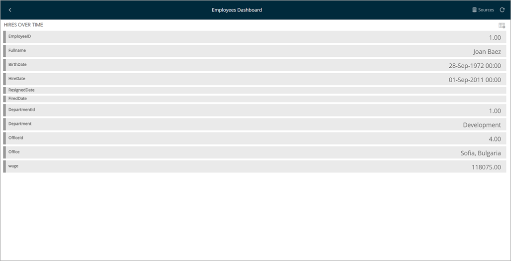
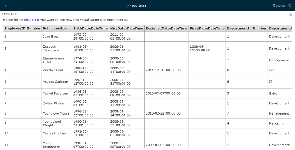
Text View
The Text View displays information that follows a key-value pattern, such as a contact's card information (e.g. Fullname: Joan Baez). It does so by displaying only the first row of data paired with the column's label.
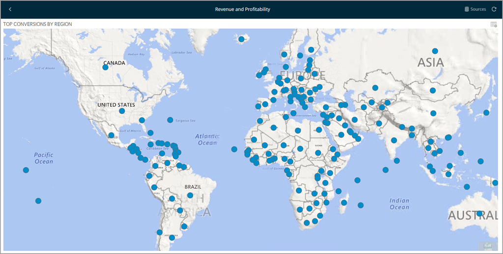
Map View
To display information graphically on a map, you can select the Map visualization option, which attempts to bind each row in the data set to a location in the world map.
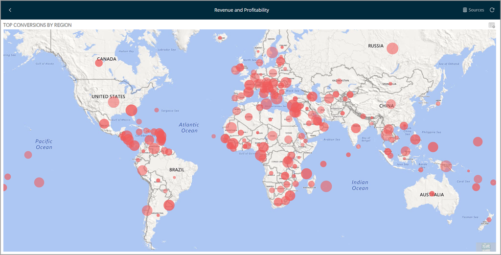
Formatting
Sometimes, you want to do more than just displaying a pin in a map. For instance, you may need to display a magnitude for each point in a map. ReportPlus allows for two additional capabilities in the map view. The first one is to display colored circles sized by the magnitude of the value, which can be achieved by selecting a value in the "Value Color" configuration in the map settings when creating the dashboard in iOS or Desktop.
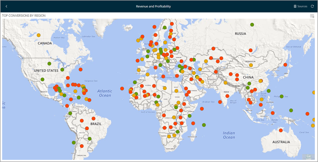
The second formating option is to enable conditional formatting on the map view in iOS or Desktop and allow different icon markiers to appear differently on the map. This is achieved through the conditional formatting configuration on the numeric column selected as "Value" in the Map's settings.
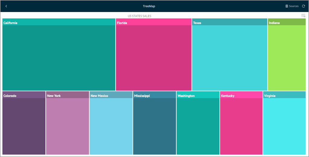
Tree Map View
The Tree Map visualization displays information hierarchically using tiles of different sizes across your widget. The visualization aims to help you discover patterns, with the proportion of each rectangle representing a different metric.
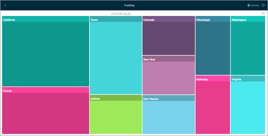
There are three different layouts for the Tree Map:
- Squarified: all data is represented in tiles, which makes data easier it easier to identify patterns and relations between similar data.
- Slice and Dice: the direction is changed to a horizontal-only layout, where the sizes of each "slice" is sized depending on the magnitude of the value. This layout is particularly useful with small amounts of data.
- Strip: the strip layout is a hybrid between the Squarified and the Slice-and-Dice layouts. The direction is changed to a horizontal layout, but with the tiles used in the squarified layout.
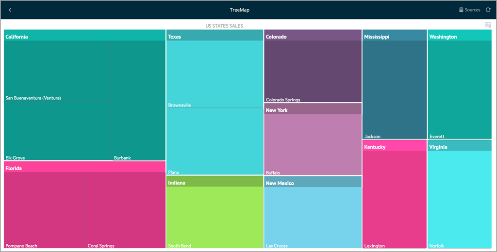
Show Details
In addition to the layout, the "Show Details" feature will allow you to add details to your Tree Map. It will break down the tiles defined by each row in the original data source based on a second field. In the following example, the parent "State" tile is broken down by "City".
Web View
The Web View displays information in an embedded browser by making a request to a URL and displaying the results. It works only with the first row in the data set, and displays the contents of the column set as URL Field in the visualization's Image Settings.
This view is a very versatile visualization option which can be used to display images, HTML pages, or event text content. If the URL Field setting is configured to a text column, it will display the text; if it's a valid URL, it will retrieve the contents of that URL and display the page.
Gauge View
The Gauge View displays a single value or a list of values, comparing them with range thresholds. The gauge also allows for conditional formatting of the different ranges.
The ReportPlus gauge support comes in four different flavors: Linear, Circular, Text and Bullet Graph Gauge.
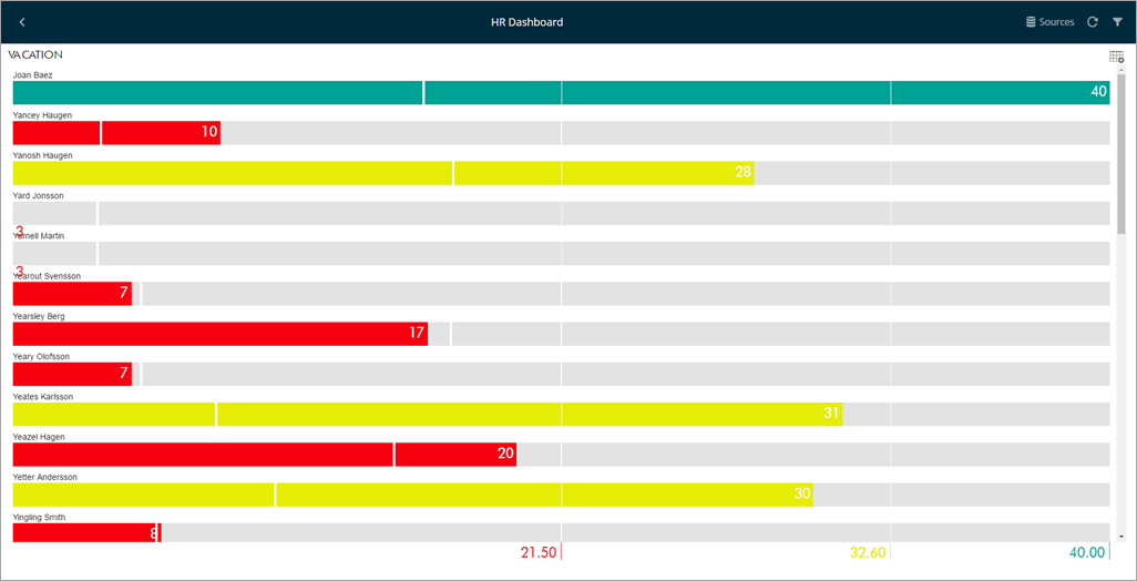
Linear Gauge
The Linear Gauge displays a label, the value of which is taken from the Label Column configuration, and a value that comes from the configured Value Column. The value is charted as a rectangle within the ranged gauge, and also appears to the right of the gauge in a numeric format.
This gauge type is suitable to compare the values of different rows side by side.
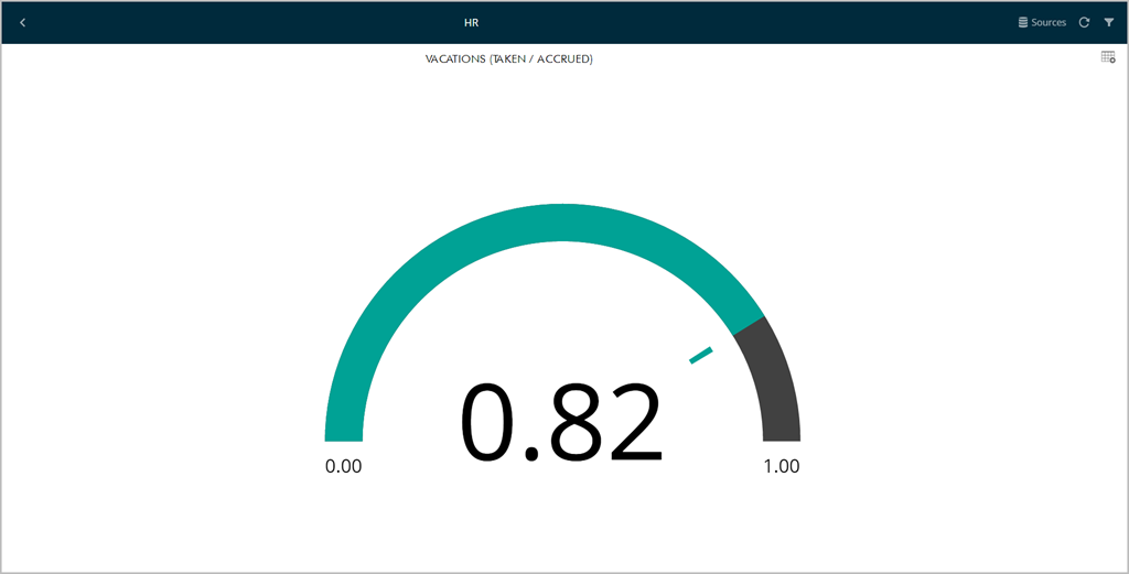
Circular Gauge
The Circular Gauge displays the band's minimum and maximum thresholds, and the current value. It also paints the background with the color of the current range.
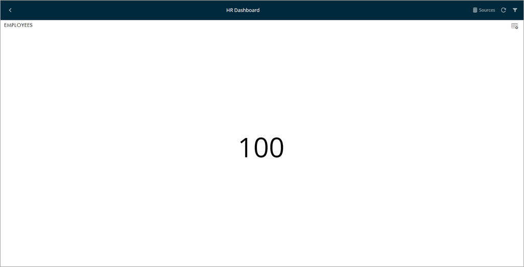
Text Gauge
The text gauge simply displays the text in a large font. It is suitable for very high priority metrics.
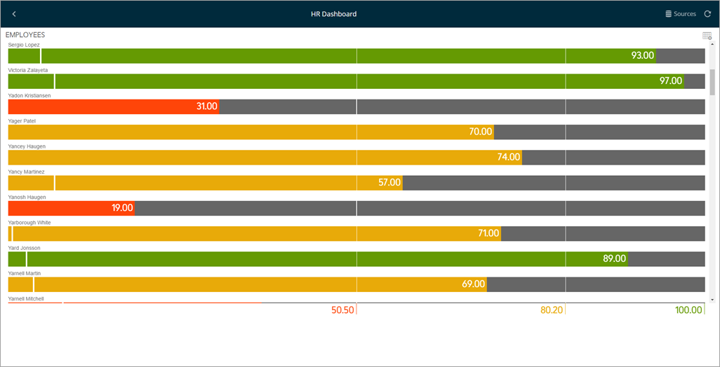
Bullet Graph Gauge
The Bullet Graph gauge is very similar to a Linear gauge; it displays a label from the Label Column and a value from the Value Column. The value is charted as a horizontal line and is also displayed on the right in a numeric format.
It also adds a new visual indicator to the Linear gauge: a vertical mark that is based on a target value from the Target column. This new indicator is retrieved from a numeric column, meaning that you need two numeric columns and a text column to configure this view.
The bullet graph is useful for comparing values side by side, while also evaluating the performance from the value (horizontal line) against the target value (vertical mark).
Charting Data
There are different chart types available:
- Single series chart types
- Column Chart
- Bar Chart
- Line Chart
- Area Chart
- Spline Chart
- Spline with Area Chart
- Circular (aka Radial) Chart
- Pie Chart
- Two or more series required chart types
- 2 Y-Axis Chart
- Stack Chart
- Stack Area Chart
- Scatter Chart
- Bubble Chart
- OHLC Chart
- Candlestick Chart
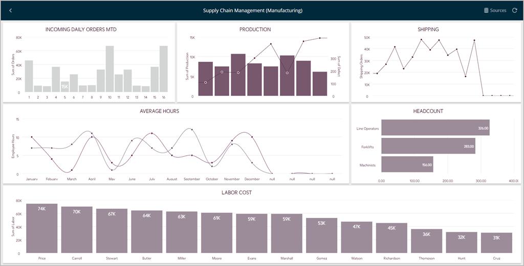
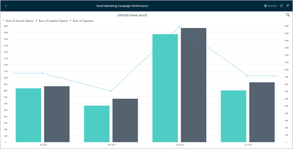
Chart Trendlines
Chart settings enable the display of trend lines, which are lines that are painted across a chart, based on an algorithm. Trendlines are a very simple, yet powerful tool to help you determine trends in data sets, and define thresholds for taking action. Among the supported algorithms are, among others, Linear and Exponential Fits, Simple and Weighted Averages.
Do-It-Yourself Visualizations
ReportPlus offers multiple components for visualizing data, including the grid view, gauge view, map view and several chart types. There are some cases, though, where you would like to have another visualization method, not supported or out of the box, that you feel would be a better fit for your scenario. It is for these cases that ReportPlus introduces the ability to do your own custom visualization component and display it in a widget as part of a ReportPlus dashboard.
A gallery with the following custom HTML visualizations is provided to be used as samples:
- Sample table view. It generates a table with the data set retrieved from ReportPlus.
- U.S. States Map. Map showing the 50 states of the US. It expects a data set with two columns, the first one with the name of the state and the second with a number used to color the state.
- Sample World Map. World Map sample that expects two columns, the first one with the name of the country and the second with a number used to color each country.

Dashboard Filters and Binding
ReportPlus allows the configuration of Dashboard Filters as a means to easily slice the contents of all the widgets in a dashboard all at once. The data sets added to the Dashboard Filters collection remain in context for all dashboard widgets to be bound to, enabling dynamic filtering of the widget contents as the filter selection changes. For instance, a data set with the list of locations around the world or a company's Departments can be added to enable binding all widgets of a dashboard. In this scenario, the contents of each widget can be filtered by department or location by the user browsing the information in that dashboard.
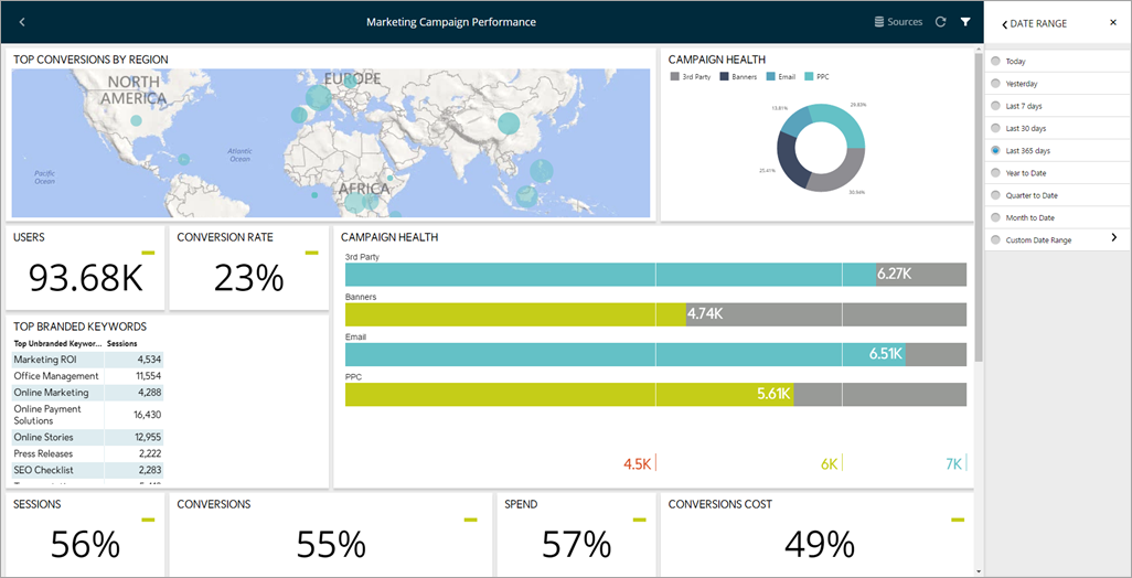
ReportPlus also supports activating a Date Range as a Dashboard Filter. This enables the filtering of all widgets by a specific period of time.
Multiple Selection
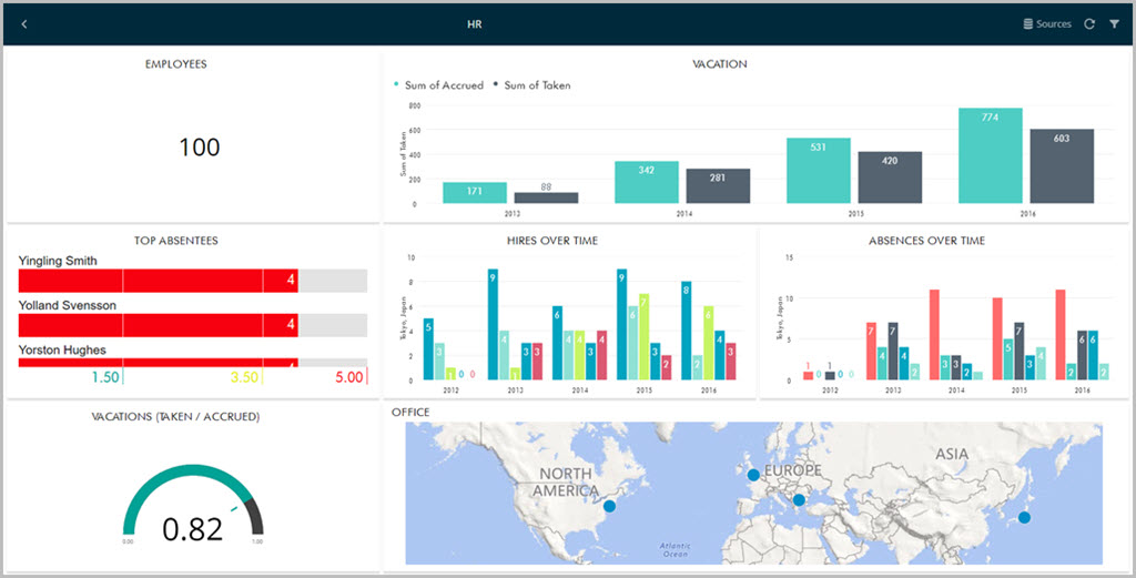
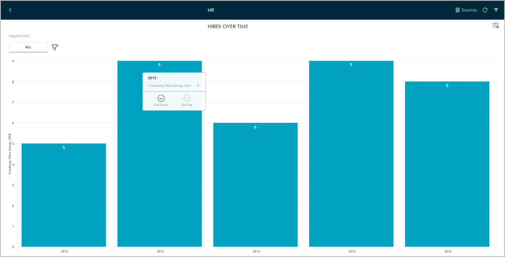
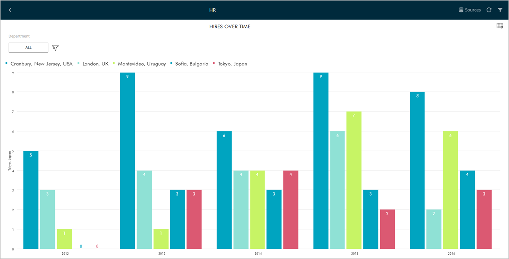
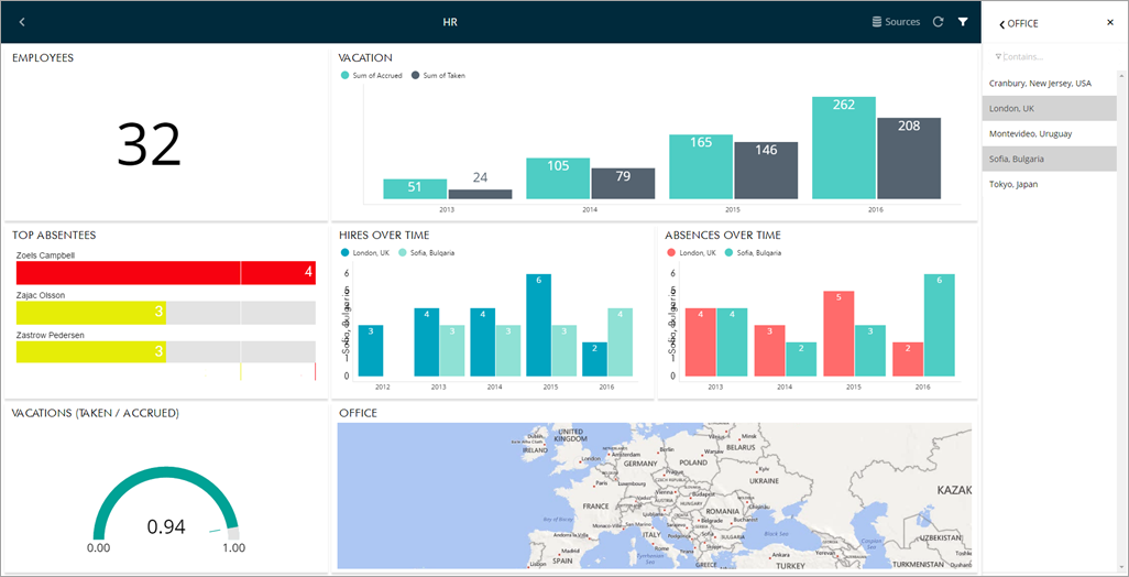
ReportPlus supports the selection of multiple dashboard filter values simultaneously. This is meant to enable side by side comparison between different elements in a collection. For instance, in the HR Dashboard dashboard you can compare the hires and absences over time of different offices by enabling multiple selection.
Dashboard filters can be configured to require a selected option or not. By default a selection is required. Making selection optional allows the user to tap on the selected row to deselect it, which removes the filter from the performed query. The query retrieves all data from the data source and No selection is displayed in the dashboard filters row. Sometimes this may not be recommended; for instance, for user experience implications, since all the charts being cluttered with tens of data series makes the data hard to read. It's up to the dashboard's author to determine which the the best option is.
Working with Data Sources
Supported Data Sources
The following are the data sources supported by ReportPlus Web:
Entering your Credentials
If you open an existing dashboard and have not yet added the Data Source credentials, you will see a message similar to the following one:
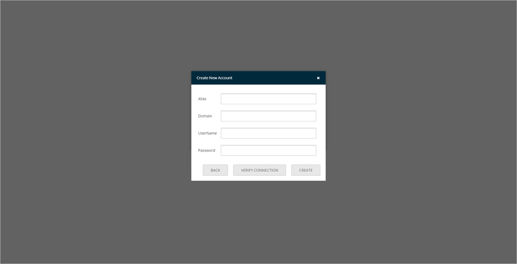
When you click Edit, you will see a new popup dialog prompting you to select or create a new account for your data source. All other information is picked up by ReportPlus Web (for example, when using Analysis Services Server, the Connection Mode, Server Name and Port are automatically identified).
You can either select one of the existing credentials from the dropdown, or click Create New Account. If you choose to create a new account, you will see the following dialog.
You will then be able to see your dashboard displayed in ReportPlus Web.