
Getting Started
ReportPlus is a self-service mobile business intelligence tool that puts the power in your hands to do dashboard reporting - all without the need for custom programming. With ReportPlus you can quickly create and edit dashboards, easily query and filter enterprise data sources, build meaningful visualization over data and effortlessly share your work with others whether or not they are existing ReportPlus users.
Dashboard Selector
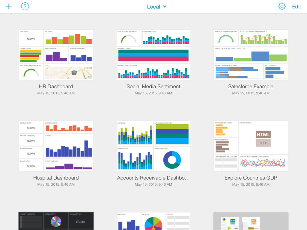
When you first open ReportPlus, you are greeted by a dashboard selector which gives you the ability to:
- Open dashboards saved in the device. These are the ones displayed as thumbnails in the initial view, and you open them by tapping on the corresponding thumbnail image.
- Open dashboards saved in content repositories, by tapping the cloud button in the top left corner of the initial view, and then navigating to the corresponding .rplus dashboard file. Supported repositories to open dashboards from are: SharePoint, Dropbox & Google Drive. In order to open a dashboard in any of these locations someone must have saved it there in the first place.
- Open dashboards shared with me. If you are subscribed by tapping the title you can toggle the view between local dashboards, and dashboards others have shared with you.
- Create a new dashboard. By tapping the + button in the top left corner of the inital view you can start to create your own dashboard.
- Access General Settings. By tapping the button with the gear icon in the top right corner of the inital view you access the general settings dialog, which among other things allows you to: set offline mode, manage accounts, reset the global cache, and access ReportPlus help's content.
- Delete dashboards in the device by tapping the Edit button, and then tapping the remove button on the dashboard you wish to delete.
Opening & Navigating Dashboards
You can open existing dashboards by tapping on the dashboard thumbnail image, in the initial view.
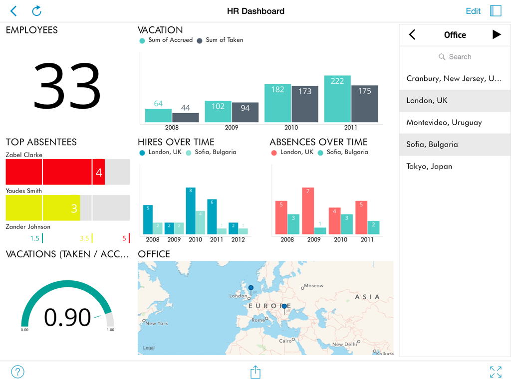
A dashboard is composed by a tile of visual blocks called widgets. Each widget is meant to display a different piece of related information, allowing you to communicate insight at a glance. This dashboard-widget structure allows you to better digest the bigger picture in your business.

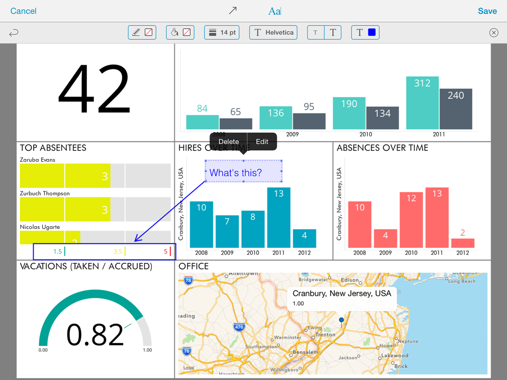
It's possible to maximize any of the dashboard widgets just by tapping it.

The maximized view not only allows a larger display of the information, but can also enable some interactions. For instance, the grid view supports horizontal and vertical scrolling, and the chart view supports zooming, panning. Also drill down & drill up actions become possible if the underlying data model supports it.

Depending on the definition of the dashboard it might be possible to filter information at the widget, or at the dashboard level. Widget filters (aka QuickFilters) are displayed on top of a widget once it's maximized. Global Filters are displayed on a collapsable pane on the right hand side .
View & Edit Modes
When first opening a dashboard, you will be browsing it in view mode. This mode allows you to navigate and filter the information displayed in it but you won't be able to change the dashboard definition. In order to apply changes to a dashboard you must switch to the edit mode. You do this by tapping the blue button labeled Edit in the right corner of the upper bar. This enables editing options, such as: adding, removing, resizing & styling widgets. Dashboards can be saved and shared in a read only mode, in which the user in order to switch to the edit mode is required to enter a numeric passcode.
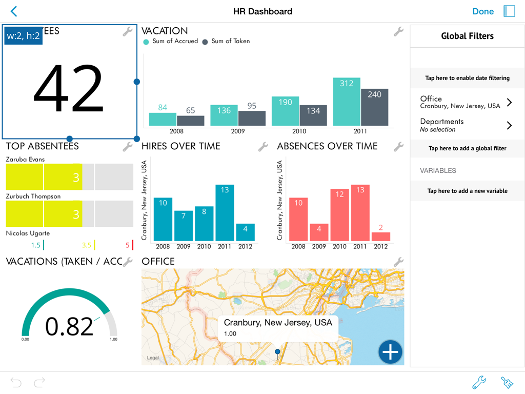
To exit edit mode you must tap the Done button in the same location as the Edit button. This switches back to the View Mode, which optimizes navigating the contents of a dashboard by removing unnecessary visual clutter.
Portrait Orientation
This orientation is by far the most intuitive and natural when using an iPhone. ReportPlus has the portrait orientation available for both iPad and iPhone.
When you rotate your device, all ReportPlus screens adapt to the new orientation except the Widget Editor, which is always displayed in landscape orientation.
Creating a New Dashboard
ReportPlus is a unique tool in it's mobile first approach, since it allows you to connect to data sources and author new dashboards from scratch anywhere, without previous server side configurations, and all from your mobile environment.
In order to start the dashboard authoring process you must first tap the + button on the top left corner of the initial dashboard selector view of ReportPlus.
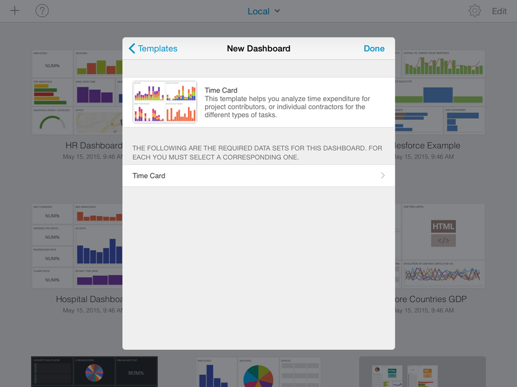
Creating Dashboards based on Templates
Once you tap the + button the Dashboard Template selector is displayed. When creating a dashboard you can opt to start one from scratch, with any of the blank templates, which only predefine a layout for the widgets, or you can select any of the existing Dashboard Templates.
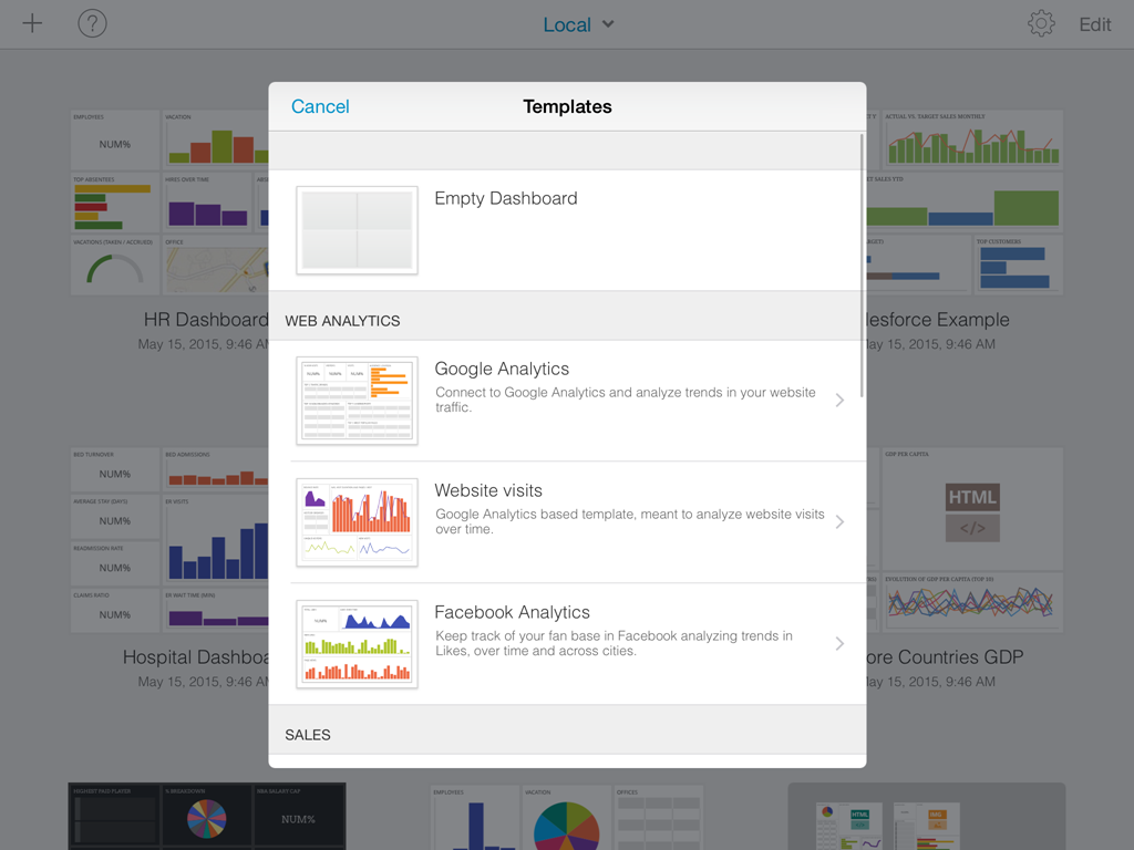
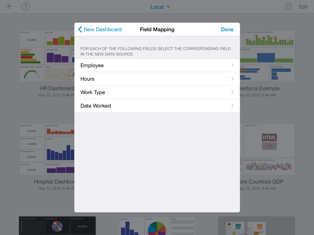
Dashboard Templates are pre-canned dashboards, that just need to be plugged in to your data to be used. Each template has a data contract that needs to be fulfilled to be instantiated. Some are bound to a specific type of data source. For instance the Google Analytics dashboard is meant to be used only with Google Analytics connections. Others can connect to any data source, as long as the mapping between the fields the template requires and the ones provided by the new data source is defined.
Dashboard Templates are good starting points to analyze common business scenarios. Once a template is successfully used, it will display your data, and you can modify it, as any other dashboard, to tailor it to your needs.
Creating a dashboard from scratch
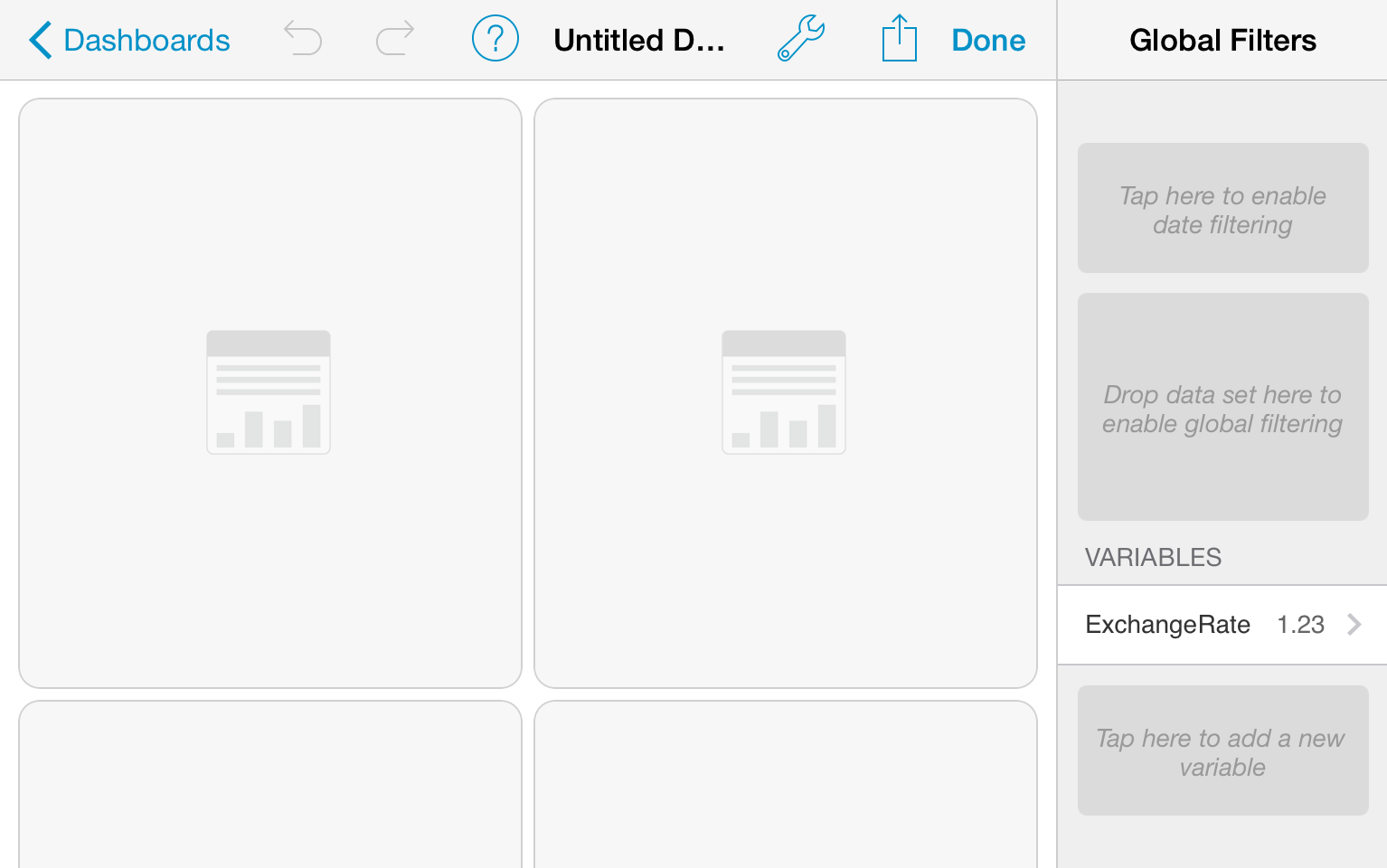
If the blank templates is selected in the template selector the following dashboard canvas is displayed.

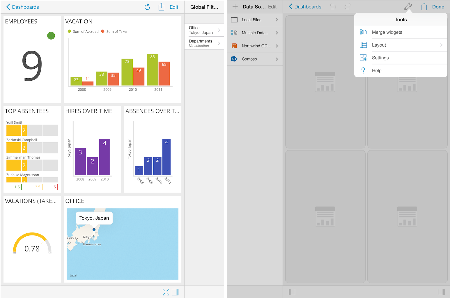
The left-hand panel of the editor lists the defined data sources, You can configure a new data source, by tapping the + button at the top left. This panel can be collapsed by tapping the button to the left in the bottom bar.
In the center section you will see the dashboard canvas, that contains the widget placeholders where data sets can be dropped. On top of it you will see the navigation bar, which provides access to the UNDO and REDO buttons, and the Tools and Actions menus.
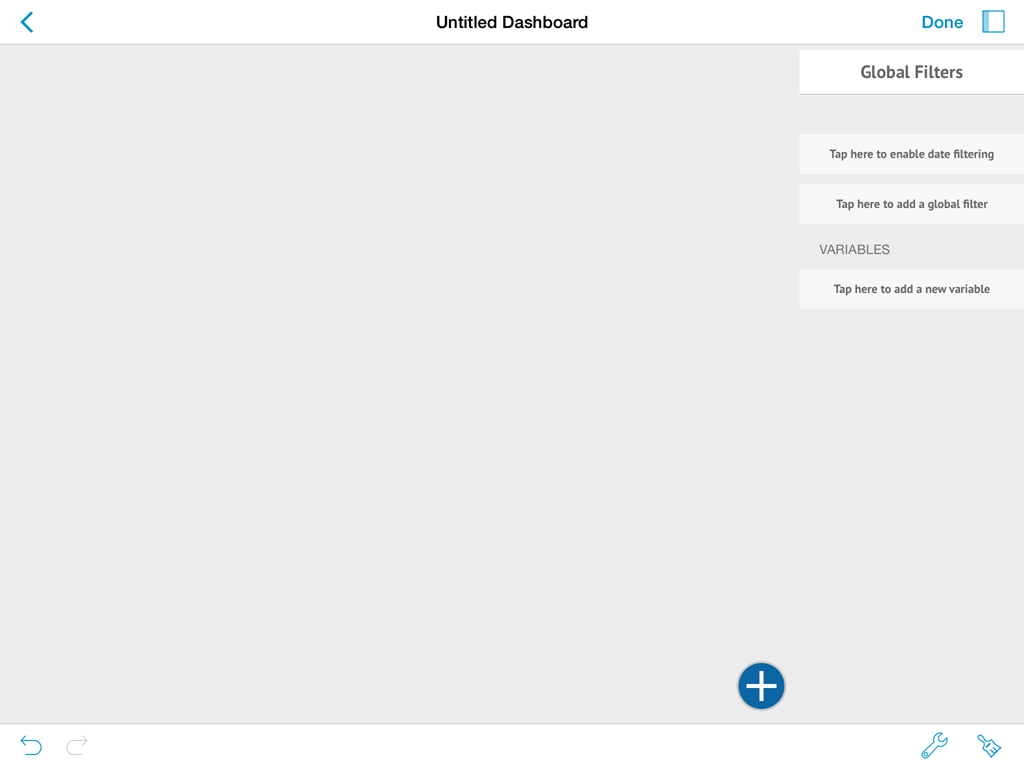
A panel to the right can be expanded by tapping the button at the bottom on the right hand side. This panel corresponds to the Global Filters.
Creating a New Data Source Connection
In order to enable the creation of dashboards, ReportPlus provides the capacity to connect to a number of enterprise data sources to retrieve the information from. The ReportPlus application connects directly to the supported data sources, meaning it's does not require any changes to be made on the server side. For a user to be able to create a connection to a data source it needs to have a set of credentials with permissions to read the data. It's also possible to push the information into ReportPlus, for instance as an excel spreadsheet sent by email, or from another iOS app. ReportPlus supports more than 20 data source types, and these are categorized as: Content Managers, CRMs, Datastores, Social Networks, Web Analytics and Others. A separate option is left for joining data sources into a new data sources. This last option is listed as Multiple Data Sources.
Creating dashboards based on Excel spreadsheets, or CSV files, are common scenarios. It's possible to do this in three ways, namely, send the file from another iOS app, or pull it from a content repository in the cloud, or pull it from a public url, configured as a web resource. In the first case the file is copied to the Local Files folder, that appears listed in the Data Sources panel. For more detail on these three methods check the How to import spreadsheets article
The + button on the top left pane prompts the new data source wizard dialog. This dialog is meant to guide you in the process of configuring a new connection to a data source.

The first input you need to provide is what type of data source you wish to configure.
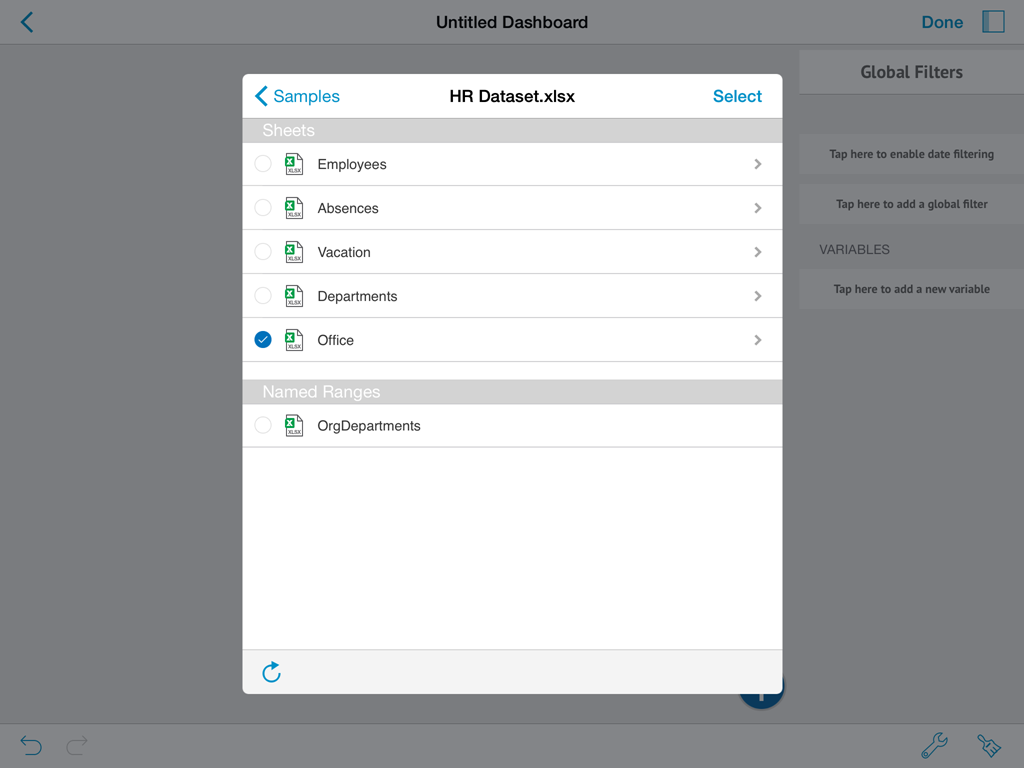
For instance, suppose you'd like to create a connection to a SharePoint site. In order to do this you would have to select Content Managers, then SharePoint. Once you do this, you are expected to enter information such as: URL Address of the sharePoint site, and authentication credentials, such as user, domain, and password information. The specific fields required to configure a connection vary between the different data sources. Once you have entered all the required information you must tap the Verify Connection button, which attempts to establish a connection with the data source, and confirms whether it succeded or not. If it succeded you may tap the Save button afterwards, and a new item will appear in the Data Sources panel, corresponding to your new data source connection. You will be able to navigate the contents of this new data source by tapping on it.
In the case of SharePoint connections you can navigate the hierarchy of sites, subsites, and lists. In the dashboard creation process you can use files, such as Excel spreadsheets hosted in document libraries

Another example would be to configure a connection to a SQL Server database. In this case you'd have to select Datastores, and then SQL Server. In this case in particular you are presented with an option to discover SQL Server instances in the network, displayed as a button in the Hostname field. Once you save the connection you will be able to navigate it to list all databases in a SQL Server instance, and within a database see all tables, and views.

Once you select a data source you can add a data set to the dashboard by simply dragging the data set item from the left in the data source panel and dropping it on a dashboard widget placeholder.

Chart Wizard
Once a data set is added to the dashboard canvas the Chart Wizard is automatically displayed. It's goal is to assist you in the process of choosing the best way to visualize the information contained in the selected data set. It suggests chart types typically used on common data analysis scenarios. By forcing you to choose whether you want to do a comparison, analyze a relationship in the data, a distribution, a composition, or performance, it guides you through the process of selection the fields required from the data set to do so.

It can be skipped altogether by tapping the Skip button on top, in which case it takes you directly to the Widget Editor.
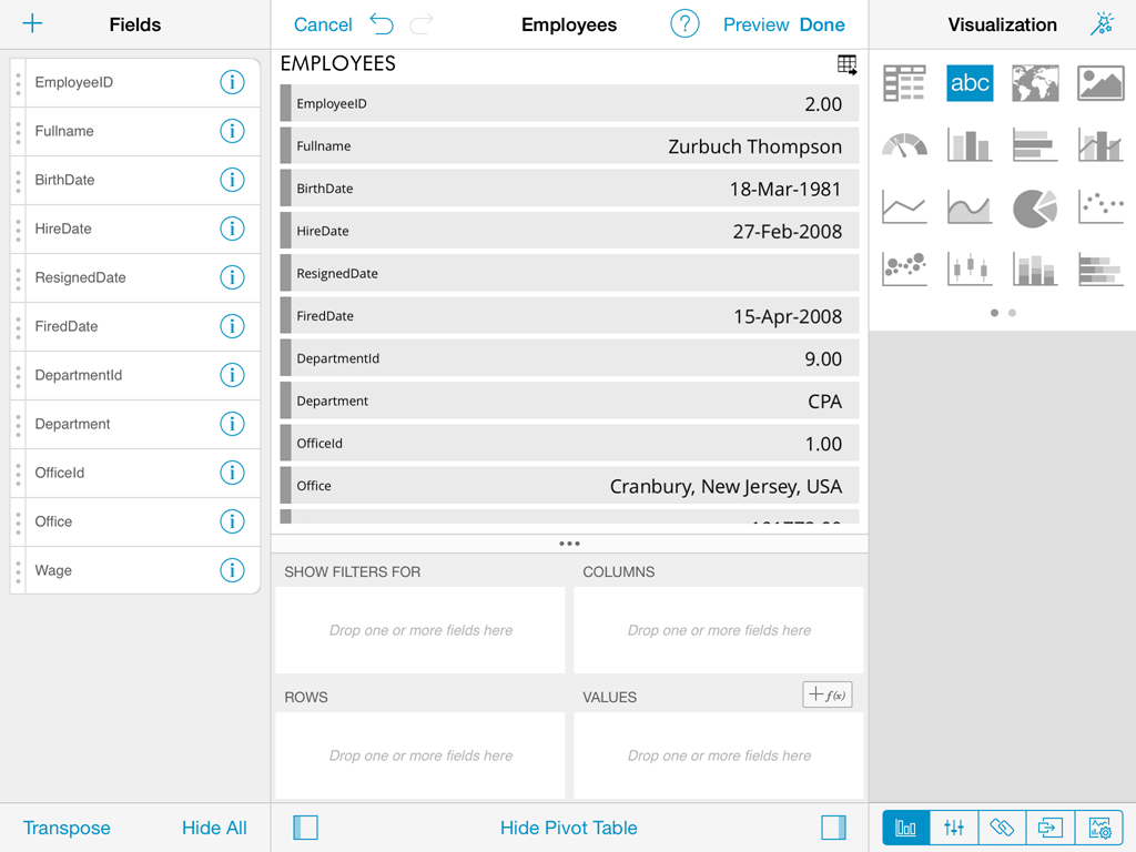
Widget Editor
Once a data set is selected the widget editor is automatically displayed. This view helps you massage the data, and select the most suitable visualization for it, making it as easily to digest as possible. From this view you can:
- Hide & reorder data columns
- Sort & filter data
- Aggregate data in the pivot table
- Chart & format data visually
- Bind the widget data to a dashboard page selection
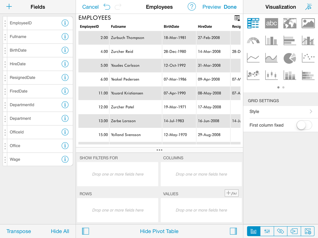
After you're done building the report and selecting the appropriate visualizations, tap the Done button to return to the dashboard editor. In the editor you can take control of the layout and resize and move widgets around to any position in the dashboard grid.
Reusing Widgets
Speed up the creation of dashboards by reusing existing widgets, you just need to duplicate or copy & paste any widget you want
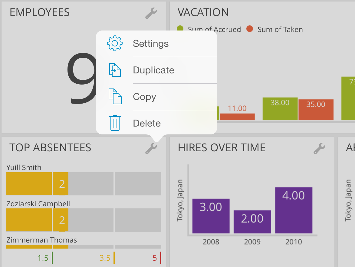
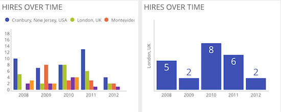
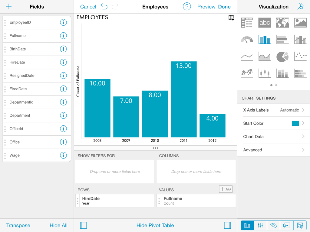
Duplicate. Create an exact copy of the original widget within one dashboard. Sometimes you need to duplicate an already customized widget and then tweak the duplicate's data set. For example, the charts below show Hires over time for all offices and a specific one separately
Copy & Paste . You can copy & paste any widget within a dashboard or even across dashboards. Note that you can create new dashboards by mashing up widgets from other dashboards.
In addition, you can paste your widgets on third party apps like Mail, Keynote, Numbers, and more. As a result, you get an image with a capture of the visualization. The only exceptions is when you copy widgets with the grid visualization, in that case the result is a table with figures.
Styling dashboards

ReportPlus supports styling options both at the dashboard level, and at the widget level. Style settings that can be defined at the dashboard level are:
- Background. Change the background color, or optionally display a background image.
- Foreground. Change the default foreground color used by all widgets centrally.
- Margin. Allows to change the margins of the dashboard.
Widget styling options are:
- Background. Change the background color, or optionally display a background image.
- Foreground. Change the foreground color used by a single widget.
- Margin. Allows to change the margins of the widget.
- Padding. Allows to change the padding of the widget.
- Border. Enables to display widget borders.
In order to change dashboard style settings, go to Dashboard Settings which is the first icon in the top right corner, and then select the Style menu option. To style a widget tap in widget settings > styling.

Saving & Sharing
At some point in the dashboard creation process you will want to save your advance. You should know that dashboards are automatically saved locally every 30 seconds. If for some reason, the application is terminated the next time you open ReportPlus you should see a screen such as the following, allowing you to retake your effort where you left it.

You can also choose to save explicitly your dashboard, in which case you must provide a name, and define whether to save it locally or in a shared repository.

Sharing Insights
You are able to share your dashboards easily by using the following options:
- Email. Email the dashboard to another ReportPlus user.
- Email Screenshot. Email a screen capture of the dashboard.
- Export. Export a document with a snapshot of the dashboard's data and email it, or send it to another app.

All these options allow you to introduce annotations to the shared image, or exported document screen captures.
Data Visualizations
In order for users to get the most insight possible out of business data, ReportPlus provides several options to customize the way information is visualized. This document describes different data visualization & styling options available when presenting data and building your dashboard.
Grid View
The grid view is the default visualization option for displaying data which presents the information in a matrix. The grid can be customized by applying a set of predefined styles in ReportPlus. The different grid styles are variations in the the appearance of borders and background colors as applied to headers, rows and cells.You may also choose to enable an alternating background color for grid rows.
You can resize the width of a column in the grid just by tapping the grid header, which will highlight the column in the grid, and then drag the resize handle in the column header. Slide it left or right to modify the column's width.
Note: The grid view is suitable in a dashboard when the number of rows, and columns is less than 10. When you're dealing with small amounts of data, the preferred approach may be to "just show the numbers".
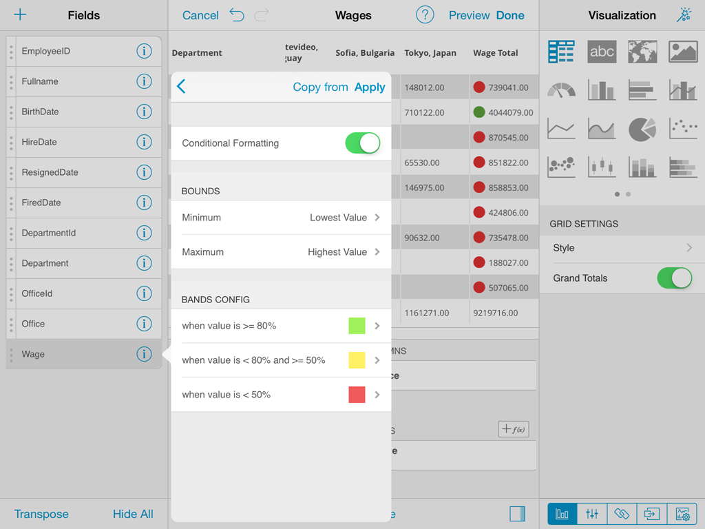
Conditional Formatting
The grid view, among other views, allows you to provide different formatting of the cell depending on the values found in a numeric column. For instance, values in the lower 20% range of a grid, can be colored with a red background to signal a problem.
Enabling Conditional Formatting
The following steps are required to enable conditional formatting on a numeric column, tap the column item on the fields list to prompt the column settings dialog. If the grid view is selected, and the column data type is numeric, then the conditional formatting configuration item is displayed, but it is initially disabled.
The conditional formatting configuration allows you to establish styling rules, per ranges of data, up to three ranges (typically used for styling, upper, middle, and lower ranges). Depending on the nature of the information, low values might be a good or bad signal, so you have the flexibility to configure the styling in the way that makes the most sense in your situation.
Styling options in conditional formatting include: background and foreground color, as well as the use of a marker icons available from a preconfigured set which ship with ReportPlus.
Once conditional formatting is enabled on a column's settings a traffic light icon appears on the column selector, in the left-hand panel of the pivot editor.
Text View
The Text View displays information that follows a key-value pattern, such as a contact's card information (e.g. Name: John). It does so by displaying only the first row of data paired with the column's label. In order to display a specific row it's possible to apply filters to make sure that's the only row displayed, so it's the one picked up by the Text View.
There are eight possible styling options, and it's possible to enable the first column to be highlighted. The Text View also supports conditional formatting, as explained in the previous section (the ability to style with different colors, and icons).
The text view is suitable when you want to allow the viewer to easily digest the attributes of a single entity. Examples include product specifications, or a person's contact information, etc.
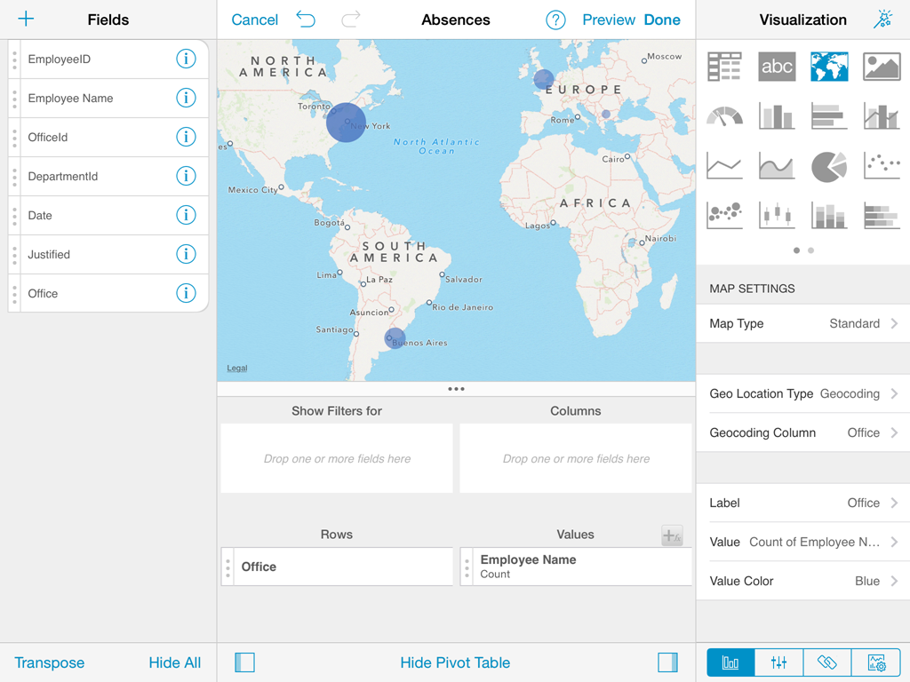
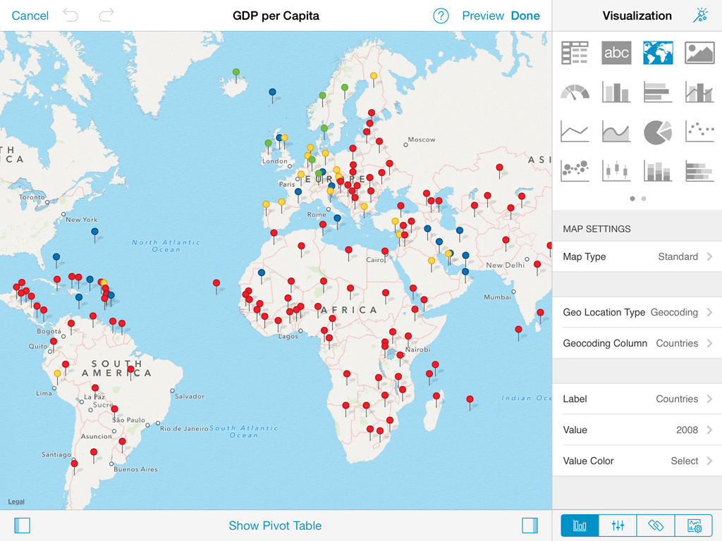
Map View
To display information graphically on a map you can select the Map visualization option, which attempts to bind each row in the data set with a location to the world map.
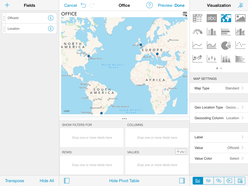
The map type displayed can either be the standard political map, a satellite picture, or a hybrid between the two. This is configured, from the map Type setting.
Geo Location
The intelligence of where to plot points in the map, based on the data set values, in ReportPlus is based on one of two methods, either geocoding, or geo-coordinates (e.g., latitude and longitude).
Geocoding assumes that the text value describing the location comes in one of the datasets columns, and will be translated into a geographical location. This location feature works well for country, state, and town names, but for more ambiguous locations it might not generate the expected result.
On the other hand, geo-coordinates assume that latitude and longitude information comes as part of the data set, and it's present in some columns. Accepted formats by ReportPlus are two:
- only one column containing both latitude and longitude information separated by a comma.
- two different columns that must be mapped to latitude, and longitude respectively.
By default the map is configured to attempt geocoding based-localization, based on the values of the first column of type text. To change the default configuration you must change the Geo Location Type setting in the Map configuration dialog, to switch between geocoding, and geo-coordinates.
To change the column that contains the expected location information, you must change the selection associated to Geocoding Column.
Formatting
By default the map view plots, when possible, each row of the data set with a blue pin marker in the map. Whenever the user taps on any of those pins, the text contained in the column selected as Label in the configuration is displayed.
There are occasions when it's desired to do more than just display a pin in a map. Sometimes the user may need to display a magnitude for each point or a state. For these cases ReportPlus allows to associate a numeric value column, to the point that was located with the methods described in the previous version. This allows two additional formatting capabilities in the map view. The first one is to display colored circles sized by the magnitude of the value. This is achieved by selecting a value in the Value Color configuration in the map settings.
The second formatting option is to enable conditional formatting on the map view and allow different icon markers to appear differently on the map. This is achieved in the conditional formatting configuration, of the numeric column selected as Value in the Map View settings.
A text label is displayed in the popup by default, but you can change this behavior by selecting a value column. By doing so, when tapping a pin in the map the corresponding value will be shown in the popup.
Web View
The web view displays information in an embedded browser. It can be configured to make a request to a URL and display the results.
This view is a very versatile visualization option, which can be used to display images, html pages, or even text content.
The Web View works only with the first row in the data set, and displays only the contents of the configured URL Field column. If the URL Field setting is configured to a text column, it will display the text, if it's a valid URL, it will retrieve the contents of that URL and display the page.
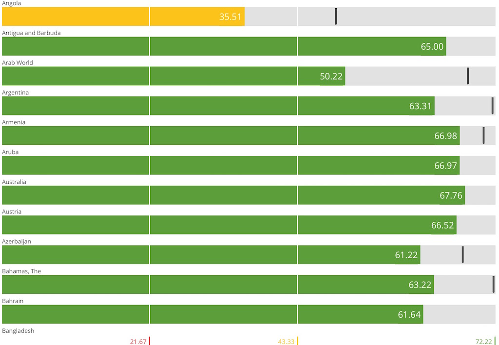
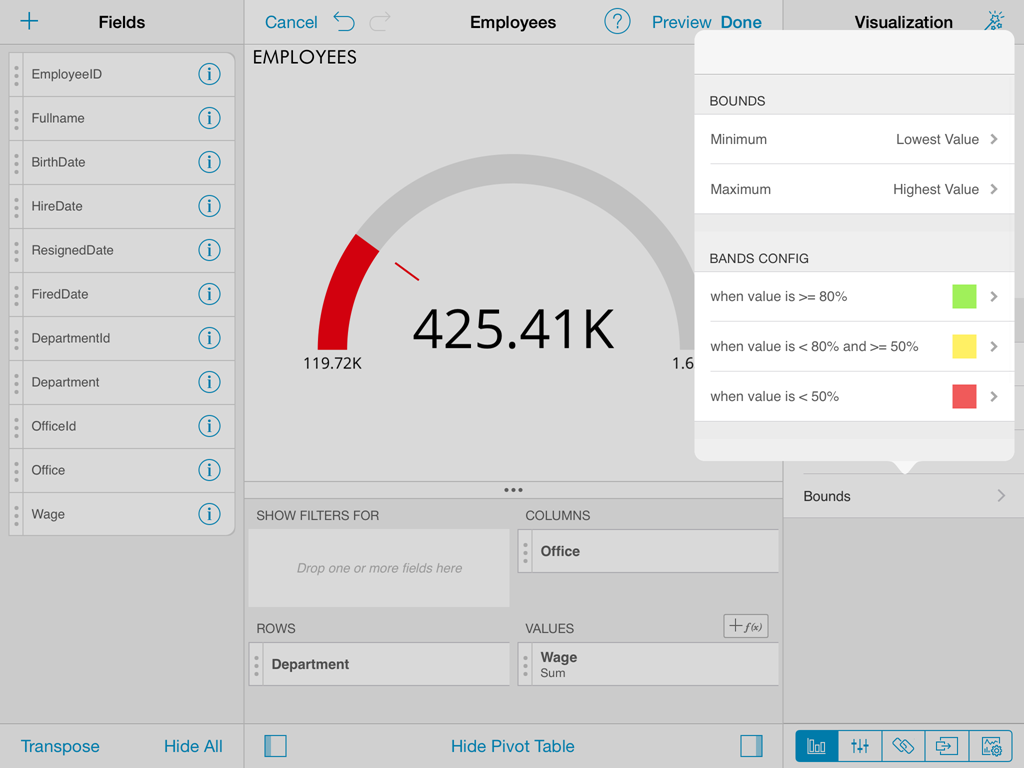
Gauge View
The Gauge View displays a single value, or a list of values, comparing them with range thresholds. The gauge also allows for conditional formatting of the different ranges. To select gauge view, tap on the gauge-shaped icon on the Visualization options menu.
ReportPlus gauge support comes in three different flavors: Linear Gauge, Circular, and Text. You can switch between gauge types by changing the settings selection in the gauge Type field.
Linear Gauge
Linear Gauge displays a label, which value is taken from the Label Column configuration, and a value that comes from the configured Value Column. The value is charted as a black rectangle within the ranged gauge, and also the value appears to the right of the gauge in a numeric format.
This gauge type is suitable to compare the values of different rows side by side.
Circular Gauge
The circular gauge displays the band's minimum and maximum thresholds, the current value, and paints the background with the color of the current range.
Text Gauge
The text gauge simply displays the text in a large font, along with a circular marker icon to draw attention if the range is either yellow or red colored. This flavor is suitable for very high priority metrics.
Bullet Graph Gauge
The Bullet Graph gauge is very similar to a Linear gauge, it displays a label from the Label Column and a value from the Value Column.
The value is charted as a horizontal black line and it is also displayed on the right with numeric format.
The Bullet Graph adds a new visual indicator to the Linear gauge, a vertical mark that is based on a target value from the Target column.
This new indicator is retrieved from a numeric column, meaning that you need two numeric columns and a text column to configure this view.
This gauge type is useful for comparing values side by side, while also evaluating the performance from the value (horizontal black line) against the target value (vertical mark).
Each gauge type has a common band range configuration, which is similar to the one used in conditional formatting. The configuration dialog requires:
You can display data in charts either by following the Chart Wizard or skipping the wizard and selecting an available chart in the Visualization options menu.
The Chart Wizard will guide you through a sequence of dialogs that help you define which is the best chart given your requirements. To start the wizard, tap the magic wand icon on top of a chart.
After skipping the wizard, you can select any of the chart icons displayed in the Visualization options menu. Whenever this happens ReportPlus selects the first numeric columns in the dataset and attempts to match the selected chart type data series requirements. For instance, in a Column Chart all numeric columns are added to the chart and for a OHLC chart, different columns with the Open, High, Low, Close series are expected. The selection of columns ReportPlus does automatically can be modified in the Chart Settings configuration.
There are a number of available chart types:
Configuration settings for chart types are described in the following sections.
The chart style defines the palette of colors to use to paint the different data series in a chart. When there are more series than colors in the palette, colors are repeated in a circular fashion, but with a variation in intensity.
Chart settings enable the display of trend lines, which are lines that are painted across a chart, based on an algorithm. Trendlines are a very simple, yet powerful tool to help you determine trends in data sets, and define thresholds for taking action. Among the supported algorithms are: Linear fit, Exponential Fit, Simple Average, and Weighted Average.
When you choose a chart type, ReportPlus will automatically select the columns used for the X Axis & Y Axis data. But this selection may not always have the expected outcome when visualizing the data. You may use the Chart Wizard to follow a more guided process to define the chart columns required by each chart type, or change the columns selection in the Chart Data configuration. The Chart Data configuration option allows you to select which columns must be taken into account for the chart creation. This involves selecting a column for populating the X Axis, and numeric columns to chart in the Y Axis.
In the 2 Y-Axis chart it allows you to select which numeric columns are displayed in the left and right axis.
ReportPlus also allows to configure the following chart settings:
ReportPlus supports styling dashboards at the dashboard and widget level. To change widget style properties you must tap on Widget Settings > Style.
In order to change dashboard style properties, you must go to Dashboard Settings > Style.
From this dialog you can configure the following settings:
Allows to set an image as dashboard background. This image can be taken from the images Library in the device (default option), or can be taken from the web, by
selecting the URL option and entering the image's URL in the Image field. It's possible to change the transparency settings for the image, by changing the Alpha field slider control. This is meant to enable branding of dashboard with watermark like images. The Content Mode field defines how the image resizing should behave to fit the dashbaord screen. By default Scale to Fill is selected meaning the image will be resized to fill all the screen area.
In order to change widget style properties, you must go to Widget Settings > Style.
From this dialog you can configure the following settings:
Bounds configuration
Charting Data
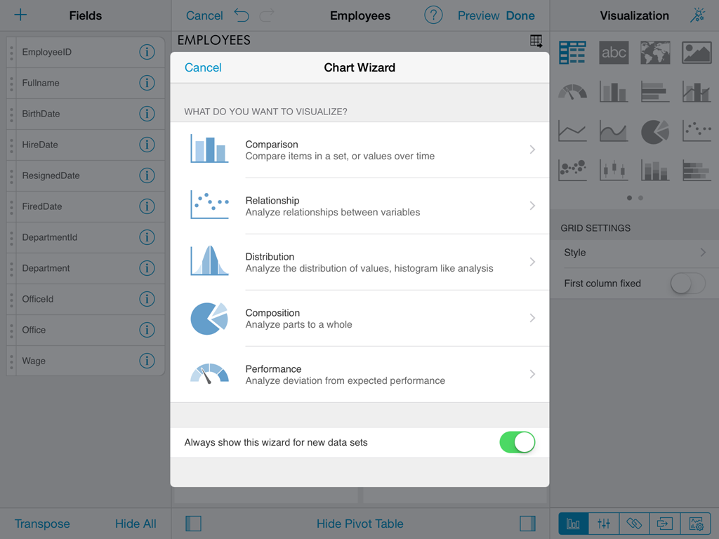
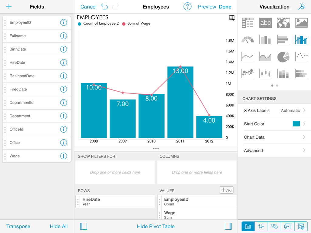
Chart Style
Chart Trendlines
Chart Data
Advanced Chart Settings
Dashboard Styling
Dashboard Style
Widget Style
DIY Visualization
ReportPlus offers mutiple components for visualizing data, among them: the grid view, the gauge view, the map view and several chart types. There are some cases, though, where you would like to have another visualization method, not supported out of the box, that you feel would be a better fit for your scenario. For these cases is that ReportPlus introduces the ability to do your own custom visualization component and display it in a widget as part of a ReportPlus dashboard.
In order to do this you must select the DIY Visualization option, in the Widget Editor, and by tapping the + button on the top right bar add the url address of a web page that generates the custom visualization of your choice. These custom web components can access the data retrieved by ReportPlus, for any of the supported data sources, by interacting with a Javascript API provided for that purpose.
Web components can be referenced either from a public url address, or as a local .webarchive file.

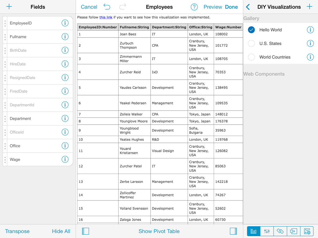
A gallery with the following custom html visualizations is provided to be used as samples:
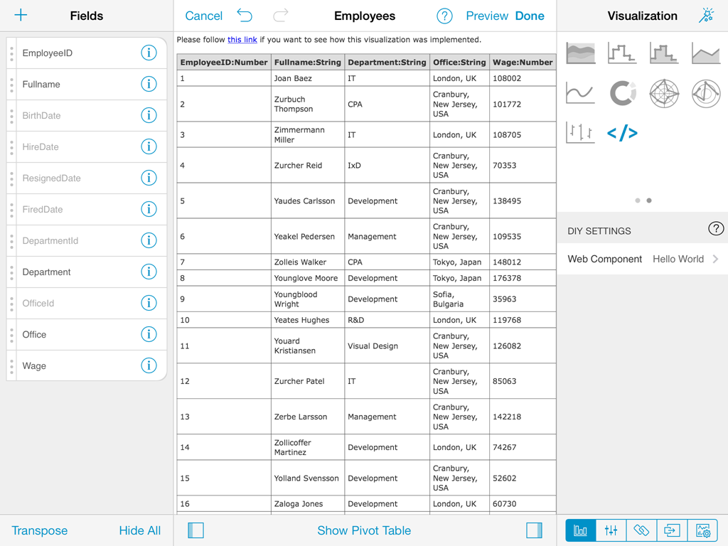
Sample table view. It generates a table with the data set retrieved from ReportPlus. At the end of this guide there's a step by step tutorial that shows how to reproduce this sample.
U.S. States Map. Map showing the 50 states of the US. It expects a data set with two columns, the first one with the name of the state, the second with a number used to color the state.
Sample World Map. World Map sample. It expects two columns, the first one with the name of the country, the second with a number used to color each country.
ReportPlus Javascript API
The Javascript API offers a way for any html page to interfase with the ReportPlus application and have access to the data retrieved from any of the supported data sources, and signal events back to the application to enable interactivity. For instance you can create a custom map that reacts to the user tapping on certain regions and triggers the navigation to another dashboard.
The interactions between the web component and the host can be the following:
- dataReady event handler of the RPBridgeListener object is declared. This notifies the host that the view is ready to receive the data. We do this calling RPBridgeUtils.notifyExtensionIsReady.
- RPBridgeUtils.notifyExtensionIsReady. Function used by web component to notify host that it's ready to receive data.
- RPBridgeUtils.sendMessageToHost. Function used by the web component to signal events to host. Receives the following parameters:
(message, action, rowData)
- message. Possible values are:runAction to signal the host a tap took place, or openURL to notify the host to open a url.
- action. Text parameter. If the message is of type runAction, it must match the given name given to Dashboard navigation action
- rowData. Parameter used to pass on to the host the value of the selected data item.
Creating a custom visualization step by step
This section shows how you can use the DIY Visualizations feature to create your own view of your data.
It illustrates the following tasks:
- Create an HTML file and add necessary script references.
- Add javascript code in order to handle visualization data sent by ReportPlus (the host application) and also signal events.
- Read incoming data and create a custom representation of it.
Step 1. Create the HTML file
Create an empty html file with references to jquery and ReportPlus bridge utils.
The first reference is just to help us manipulating the DOM and the second one has to do with connecting the visualization with the host.
Once you do this your html code should look something like the following:
<html>

    <head>

        <script type="text/javascript" src="rplus_bridge_utils.js"></script>

        <script src="http://code.jquery.com/jquery-1.11.0.min.js"></script>

    </head>

    <body>

    </body>

</html>
Step 2. Notify the host we are ready to receive data
As a second step we will add the necessary javascript code in order to:
- Notify the host that the view is ready to receive the data. We do this calling RPBridgeUtils.notifyExtensionIsReady.
- Register a "dataReady" event handler that will be called by the host after the data is ready to be consumed.
After this step the code should look like this:
<html>

    <head>

        <script type="text/javascript" src="rplus_bridge_utils.js"></script>

        <script src="http://code.jquery.com/jquery-1.11.0.min.js"></script>

        <script type="text/javascript">


            window.RPBridgeListener = {

                dataReady: function (tabularData) {


                    // Render the view


                }

            };


            $(function () {

              RPBridgeUtils.notifyExtensionIsReady();

              });

          </script>

    </head>

    <body>

    </body>

</html>
Step 3. Create the html elements that will render the custom view
Finally, we process the data sent to the dataReady function, and we generate dynamically the html tags used to render the data.
In this case we iterate over the tabularData.data array creating table rows and then we add it inside "myTable" div in the HTML DOM.
    dataReady: function (tabularData) {


        var tableView = $("<table></table>");

        var headerRow = $("<tr></tr>").appendTo(tableView);


        for (var c = 0; c < tabularData.metadata.columns.length; c++) {

            var column = tabularData.metadata.columns[c];

            var headerCell = $("<th></th>").append(column.name + ":" +

            getColumnTypeName(column.type));

            headerRow.append(headerCell);

        }


        for (var i = 0; i < tabularData.data.length; i++) {

            var rowData = tabularData.data[i];

            var rowView = $("<tr></tr>");


            for (var j = 0; j < rowData.length; j++) {

                var cellValue = rowData[j];

                var cellView = $("<td></td>").append(cellValue);

                rowView.append(cellView);

            }


            tableView.append(rowView);

        }


        $("#myTable").append(tableView);                }

    };
Complete Sample Code
<html>

    <head>

    <script type="text/javascript" src="rplus_bridge_utils.js"></script>

    <script src="http://code.jquery.com/jquery-1.11.0.min.js"></script>

    <script type="text/javascript">

        window.RPBridgeListener = {

        dataReady: function (tabularData) {


                var tableView = $("<table></table>");

                var headerRow = $("<tr></tr>").appendTo(tableView);


                for (var c = 0; c < tabularData.metadata.columns.length; c++) {

                    var column = tabularData.metadata.columns[c];

                    var headerCell = $("<th></th>").append(column.name + ":" +

                    getColumnTypeName(column.type));

                    headerRow.append(headerCell);

                }


                for (var i = 0; i < tabularData.data.length; i++) {

                    var rowData = tabularData.data[i];

                    var rowView = $("<tr></tr>");


                    for (var j = 0; j < rowData.length; j++) {

                        var cellValue = rowData[j];

                        var cellView = $("<td></td>").append(cellValue);

                        rowView.append(cellView);

                    }


                    tableView.append(rowView);

                }


                $("#myTable").append(tableView);

            }

        };


        $(function () {

            RPBridgeUtils.notifyExtensionIsReady();

        });

    </script>

    </head>

    <body>

        <div id="myTable" style="height:100%"></div>

    </body>

</html>
Data Filters
This section describes the different options for applying transformations to data sets, such as: sorting, filtering, and aggregating data. By applying filters, the information in your reports can be optimized for business analysis. You can remove unnecessary noise, highlight the most valuable aspects, and summarize information in many useful ways.
The data filtering options are accessible through the widget editor, which is displayed automatically when a data set is added to the dashboard canvas.
Widget editor
The widget editor is the place to go to apply transformations to the data retrieved from the data source, and define it's visualization.
In the iPad the widget editor has a three panes structure. The left pane displays the lists of columns of the data table queried from the data source. The central pane displays in it's upper part a preview of the visualization of the data, and in it's lower part the pivot table. The right hand pane displays initially visualization settings, but can switch from the tab options at the bottom, to display parameters settings, page binding or general widget settings. The lateral panes may be collapsed as well as the pivot table by tapping the arrow icons in the bottom bar.
The left hand pane supports the following actions over the data table:
- Searching fields. By scrolling down the list, the search input field is displayed, to enter the search query.
- Hide All or Show all fields. These buttons allow to fastrack visibility changes in all the fields at the same time. Very useful if you need to have only a small subset of columns visible you can always make all invisible, and then just change the visibility state for those few that are not.
- Changing columns order. The order in which columns are displayed is defined by the data source, but you can easily override the order by tapping and holding any of the rows in the left pane, and dragging it to the desired position.
- Transposing de data table. The button on the top right corner enables to switch columns for rows. Only the first 50 rows are transposed.
- Adding calculated fields. The + button on the left top bar allows to add calculated fields.
Field Settings
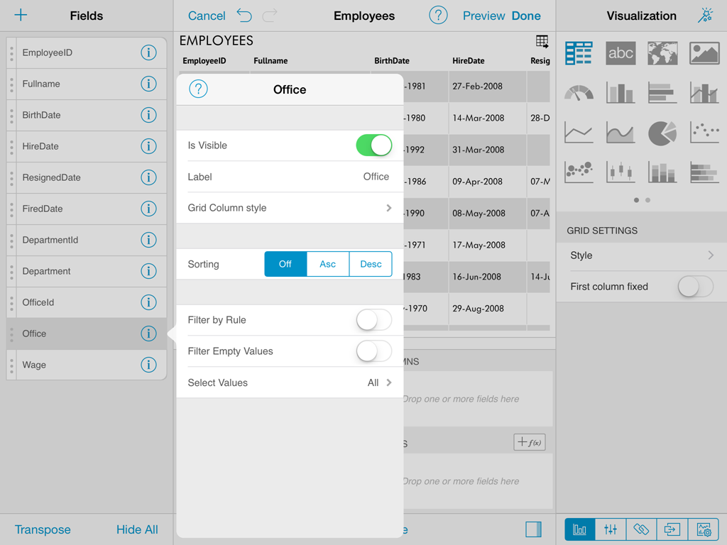
To display the column settings dialog you must tap on the field's row on the list of columns displayed on the left pane of the widget editor. This will display a popover with the dialog. Optionally you can choose to dock this dialog to the right pane, by tapping the pin icon on top. Once docking is turned on the behaviour will remain that way for all columns, and dashboards.
Column settings allows the following operations on columns:
- Changing visibility.
- Label renaming.
- Sorting data by that column.
- Formatting rules for the column.
- Applying filters.
Columns of type Date additionally support turning on Fiscal Years formatting, and when aggregated in the pivot table also allow you to configure the granularity level of the aggregation in Days, Months, Years.
Is Visible
The first option in the column's settings is to change the visibility settings. This setting allows you to remove a specific column from the data set for the current widget.
When you need to change the visibility settings for most columns in the data set, it might be more straightforward to tap on the Hide all button, on the bottom bar of the left pane, and then enable visibility only for the columns which you require in your widget.
Hidden columns are removed from the current visualization method and are grayed-out in the fields list pane on the left. For example if you hide a numeric column from a chart, the series of values in that column are removed from the chart.
Label
This option allows renaming column's labels. It's for display purposes only, for instance fields are always referenced by their original name in calculated field expressions. Once renamed, to go back to the original value erase the label completely.
Sorting
To sort by a column tap the desired sorting orientation, ascending (Asc) or descending (Desc) in the Sorting switch control of the column's settings pane. When sorting is enabled for multiple columns precedence is given by the columns position on the data set.
Enabling sorting on a column is signaled in the fields listing on the left pane with an icon.
Formatting
Numeric and Date fields enable a formatting option in the settings dialog.
To format date fields select the desired datetime format to display from a list of possible options.
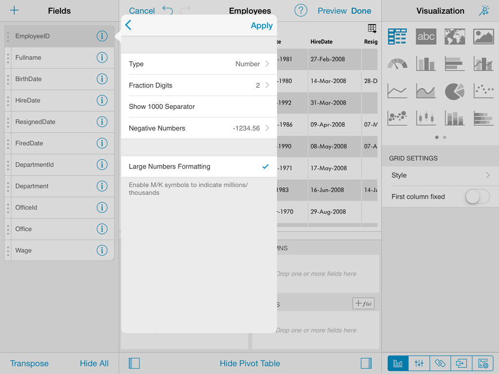
In the case of numeric fields, the options are more sophisticated. The user has the ability to configure:
- Type.Whether to display the number as percentage, currency, or number.
- Fraction digits.The amount of digits to display to the right of the decimal point.
- Show 1000 separator.Configures whether to display or not the thousands separator.
- Negative numbers.Allows you to select between enclosing negative numbers in parenthesis, or prefixing with the minus symbol.
- Currency Symbol.Allows the user to choose from several currency formats.
Filters
Filter empty values
ReportPlus provides the ability to filter rows in the data set that have null, or empty values on a specific column, by enabling the filter empty values configuration setting.
Filter by values
This type of filter supports the definition of the set of values to display for a column, filtering every other value. To enable this type of filtering, tap on the Select Values configuration setting. This in turn displays the list of possible values for a column, and there you tap to mark only the items you want to remain in the data set. Rows with values excluded by the filter aren't displayed in the column.
Filter by rule
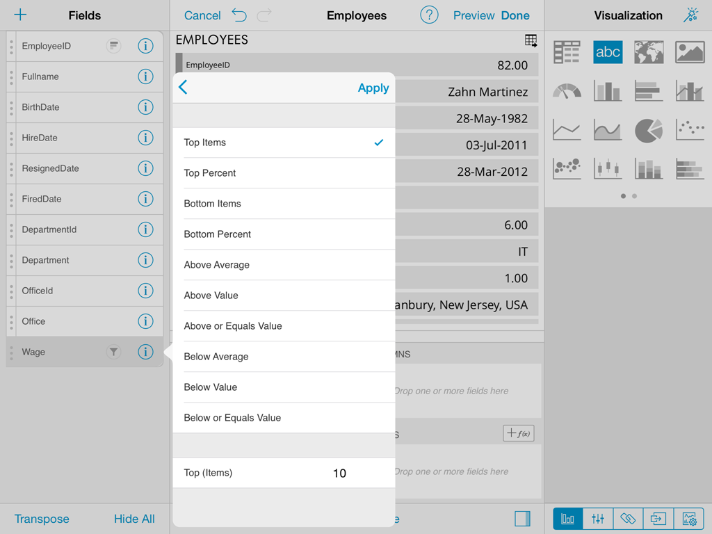
Filter by rule enables the definition of more complex rules. The available rule options change depending on the nature of the data type of the selected column, and are explained in detail in the following sections.
Rules for numeric fields
Fields of numeric types such as: integers, decimals and currencies, support the following type of rules:
- Top Items
- Top Percent
- Bottom Items
- Bottom Percent
- Above Average
- Above Value
- Below Average
- Below Value
All these rules take one parameter, which by default is set to 10, but that can be changed to be any numeric value by entering the desired value in the white textbox below the listed rule types. By default when filter by rule is enabled on a numeric field, it's set to Top 10 Items.
Rules such as Top & Bottom 10 don't necessarily mean that 10 items will be retrieved, it filters the Top, or Bottom 10 values, and if there are multiple items with the same value then more than 10 values will make the cut. For instance the top 10 countries with more sales, may yield 12 countries because the last three countries have the same amount of sales.
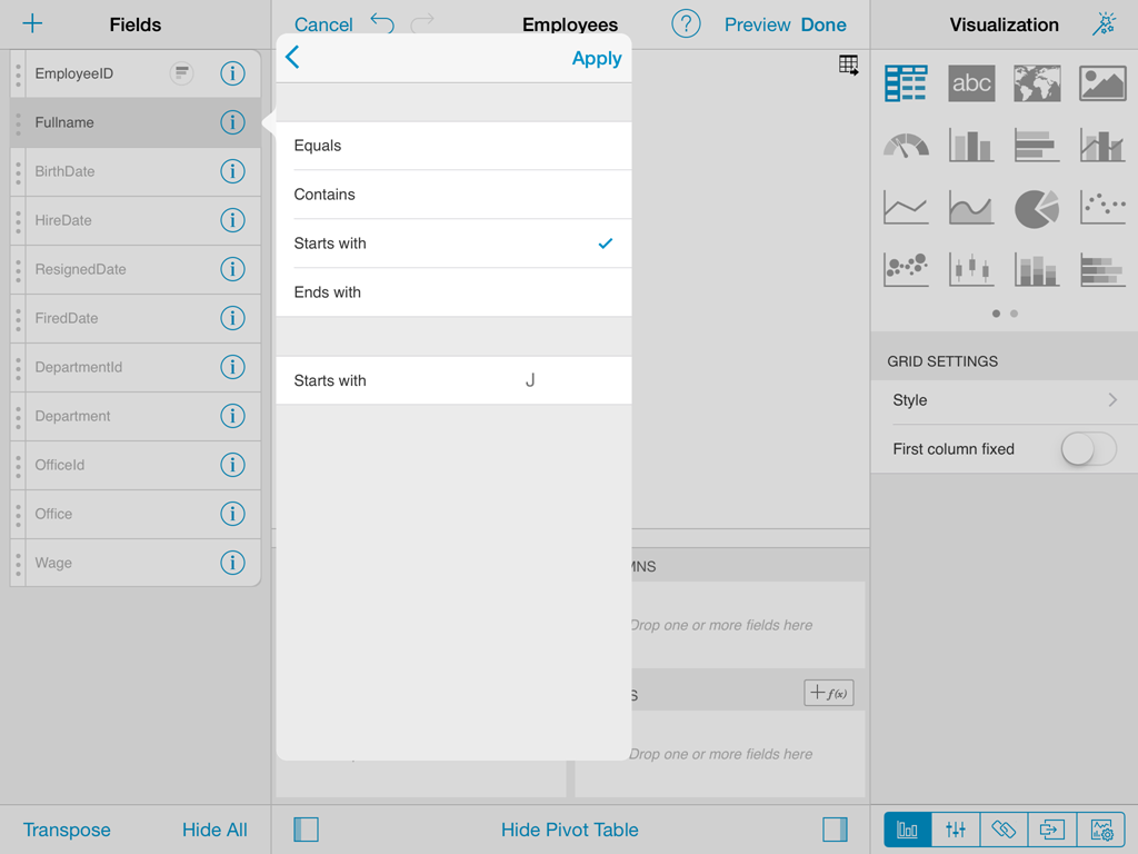
Rules for string fields
Text columns support the following type of rules:
- Equals
- Contains
- Starts with
- Ends with
Similarly, these rules also take one parameter, the value of the starts with, or equals that the rule is going to use to evaluate, and is entered in a textbox in the same position.
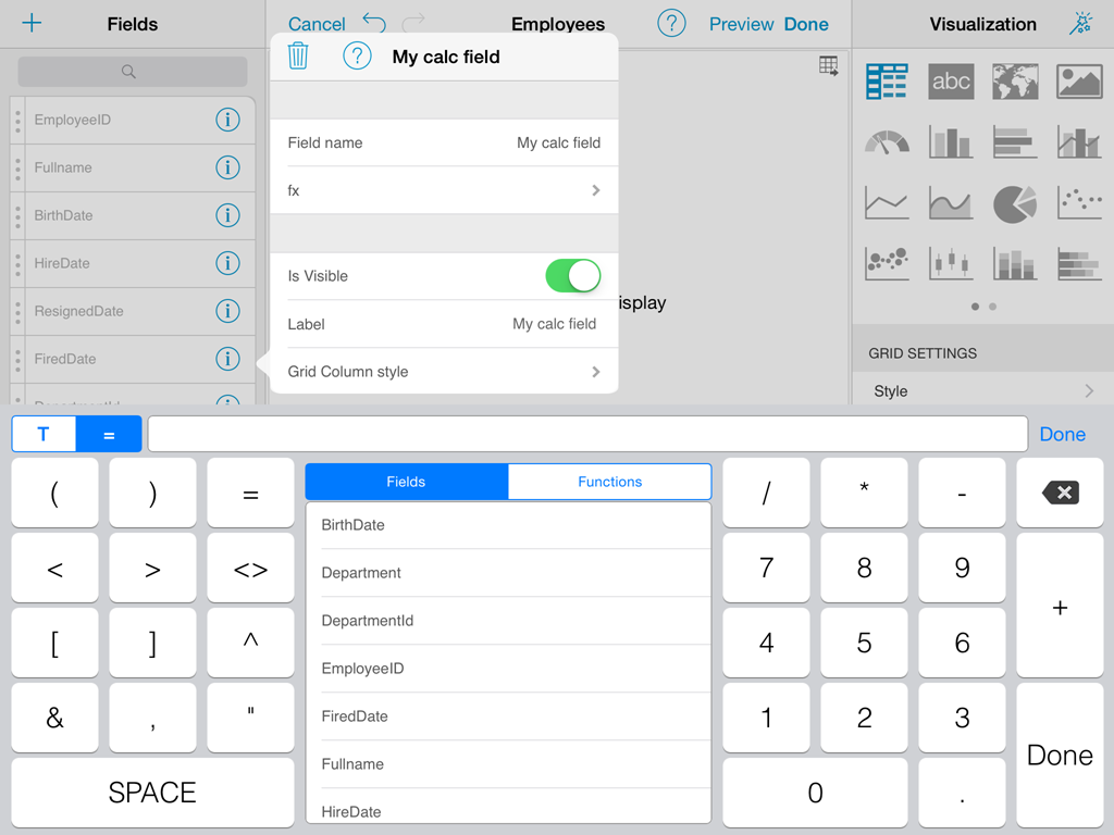
Calculated Fields
ReportPlus allows you to define new fields in the data set, named calculated fields. These fields are built based on expressions that may compose existing fields, constant values, and a set of predefined functions. In order to add a new calculated field you must tap on the + button in the top bar of the left hand panel. Once you do it, you will be prompted to enter a name for the new field, and the expression to calculate the value of the field.
The following are a set of calculated field sample expressions:
| Field Name | Expression | Sample Output |
|---|---|---|
| Age | (TODAY()-[BirthDate])/365 | 33.5 |
| Full name | [FirstName]&" " &[Surname] | John Smith |
| Sales Percentage | [Sales]*100/SUM([Sales]) | 24.233 |
| Sales Percentage Delta | ([Sales]-PREVIOUS([Sales],1))*100/PREVIOUS([Sales],1) | 1.03 |
| Name Starts with L | IF(FIND("l",LOWER([FirstName]), 1)=1, "Starts with 'L'", "Other: &MID([FirstName], 1, 1)) | Starts with 'L' |
| Event Date | DATE([EventDate],[EventMonth],[EventDay]) | 8-Feb-2013 |
| Deviation From Avg | [Salary]-AVERAGE([Salary]) | 32500 |
Calculated fields created this way are evaluated prior to executing pivot table aggregations. If you need calculation to take place after the summarization of the pivot table then you should use Pivot Table Calculated Fields.
The use of this type of fields is suitable when:
There's a need to analyze derived information. For instance, if a data set has values, per day, it might be interesting to chart the variation between days as a percentage of the total.
There's a need to bind widget information, with pages binding, but neither the pages data set, nor the widget data set has the columns data in the expected format. In these cases, creating a calculated column with a more "massaged" format may help make possible the join between data sets.
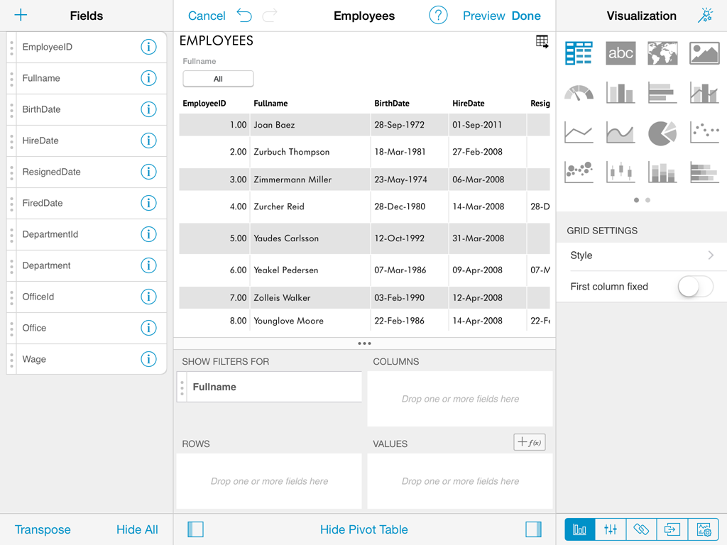
Pivot Table
A Pivot Table is a data summarization tool, which among other functions allows you to automatically count, average and total the data stored in a table like format, typically grouped by values. For instance if you have the following table:
| Salesman | Region | Product | OrderId | OrderTotal |
|---|---|---|---|---|
| John A.. | Americas | ProductX | 1001 | 10 |
| Erick B. | Americas | ProductY | 1002 | 20 |
| Pete C. | EMEA | ProductX | 1003 | 30 |
| David D. | China | ProductZ | 1004 | 10 |
| Jorge E. | Australia | ProductY | 1005 | 5 |
And you need to do the following type of analysis:
| Americas | EMEA | China | Australia | Total | |
|---|---|---|---|---|---|
| ProductX | 10 | 30 | 40 | ||
| ProductY | 20 | 5 | 25 | ||
| ProductZ | 10 | 10 | |||
| Total | 30 | 30 | 10 | 5 | 75 |
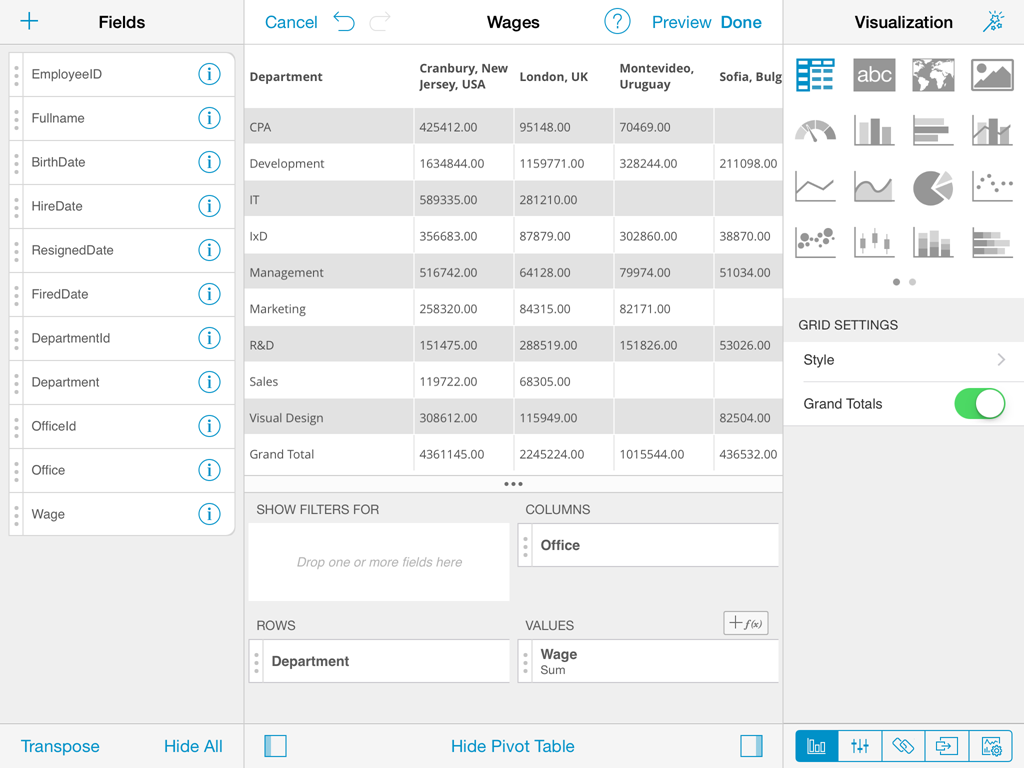
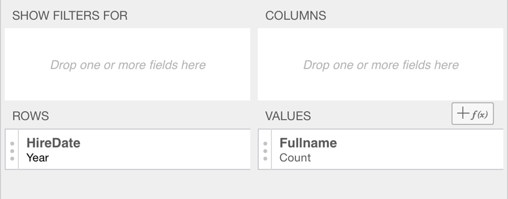
You can achieve it by using a Pivot Table where the Product field is dragged and dropped in the Rows placeholder, so that all products are listed as rows, and by dropping the Region field in the Columns placeholder, columns are created in the dynamic table for every value in the Region field.
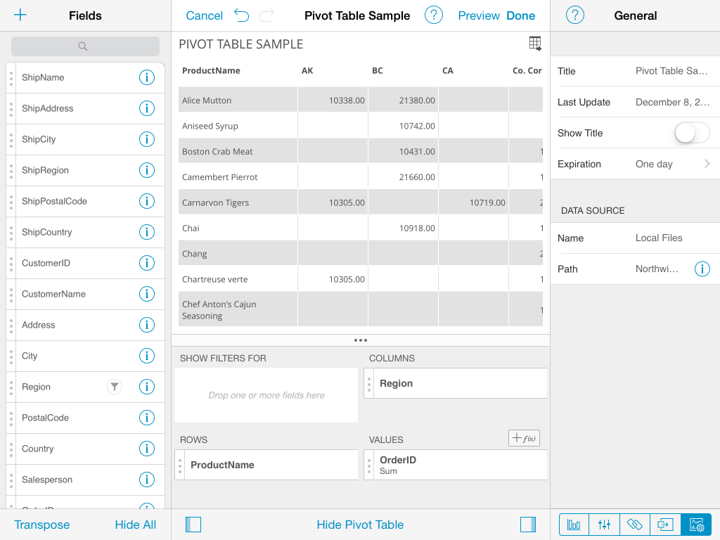
As part of the Widget Editor ReportPlus provides a Pivot Table Editor, at the bottom of the center section, which allows the user to aggregate information by dropping fields in the corresponding placeholders of the Pivot Table.
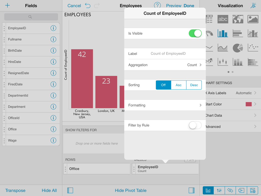
When a field is added to rows, columns, or values pivot table placeholders, tapping on the field displays the summarized settings of that field.
For fields in the values placeholder, this means the ability to configure the summarization function used (average, count, sum, etc).
For date fields dropped in the rows placeholder it means the ability to choose the level of detail in the summarization (hour, day, month, year).
QuickFilters
Column filters, defined in the column settings become part of the dashboard definition, and can't be modified by consumers of the dashboard. On the other hand, Quick Filters are a means for the user designing the dashboard to establish filters that can be dynamically changed, like parameters, by dashboard users without editing the dashboard.
In order to define a quick filter, drop a column in the Filters placeholder of the pivot table. If the visualization is either grid, or chart, then this displays a button on top of the control, which if tapped, displays a popover dialog to customize the filter values.
You can add up to four filters at the same time per dashboard widget, and the filter options displayed in the popover filter dialog depends on the data type of the field. There are three different filter dialogs, for text fields, numeric fields, and date fields.
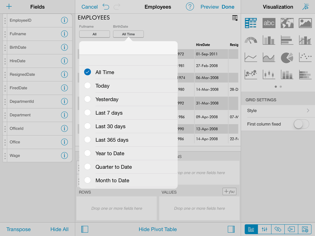
Cascading Filters
The list of possible values displayed to select from in QuickFilters will be filtered based on previous QuickFilters selections. Fields on the left take precedence and determine the list of possible values on filters to the right. For instance, if the field "Country" is dropped first, and the field "City" is dropped second the list of shown cities will be filtered by the current country selection.
Pivot Table Calculated Fields
You can add calculated fields to a pivot table that will rely on already summarized values. This is usefull to apply arithmetic operations between metrics in the values placeholder. For instance given the following summarization in the pivot table:
| Orders Count | Orders Total $ |
|---|---|
| 5 | 75 |
You could add a calculated field on the pivot to analyze the average order size, with the following expression: [Orders Total $]/[Orders Count], which would result in the following table:
| Orders Count | Orders Total $ | Average Order Size |
|---|---|---|
| 5 | 75 | 15 |
Calculated Fields in the pivot table are added by tapping the button for that purpose in the values placeholder.
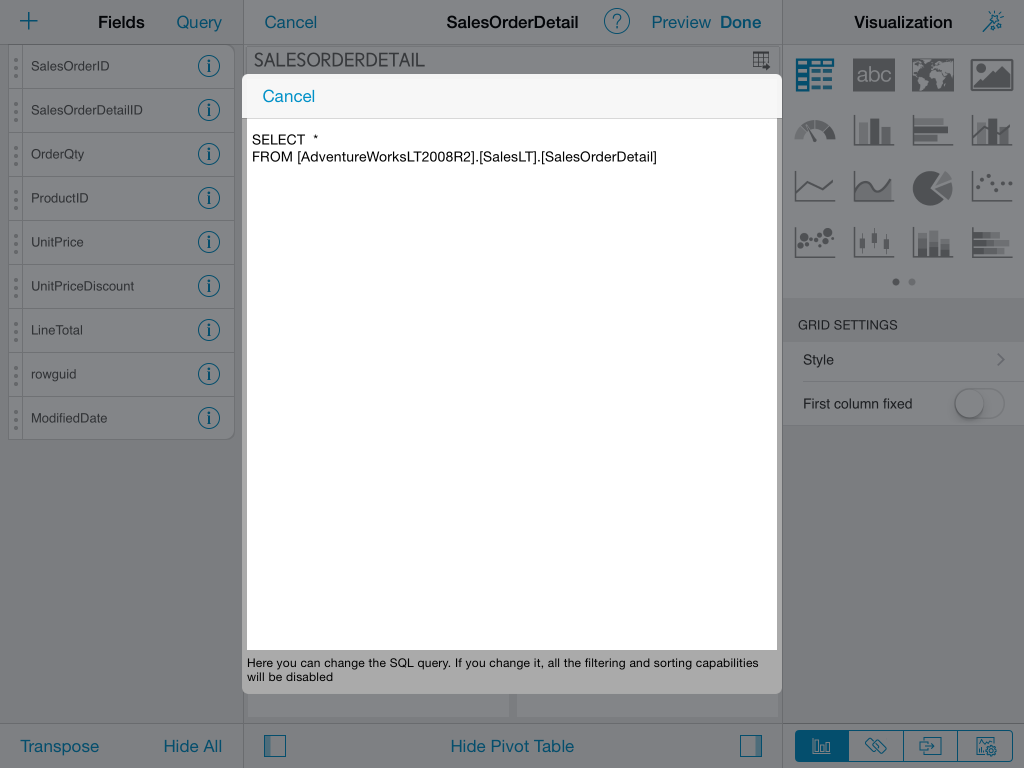
Customizing data source queries
ReportPlus supports the ability to override the query sent to relational databases, and Analysis Services connections. You can achieve this by tapping the Query button displayed on the top bar in the widget editor, which displays the currently generated SQL or MDX query, given the existing filters configuration. This feature enables advanced users to have a more detailed level of control of the information retrieved from the data source, enabling more sophisticated scenarios where information is pulled from multiple tables, and views.
Customizing the query disables filter settings. To enable them back the custom query must be erased.
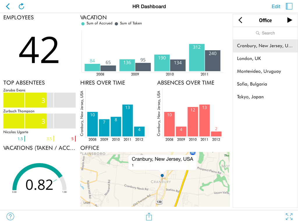
Global Filters and Binding
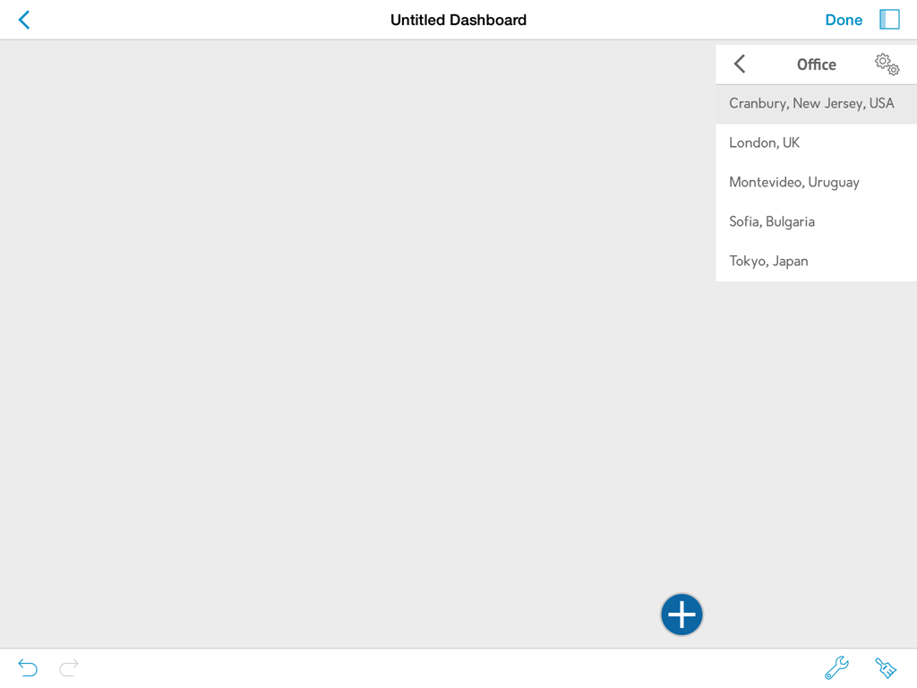
ReportPlus allows the configuration of Global Filters as a means to easily slice the contents of all the widgets in a dashboard all at once. The data sets added to the Global Filters collection remain in context for all dashboard widgets to be bound to, enabling dynamic filtering of the widget contents as the filter selection changes. For instance, a data set with the list of locations around the world, or Departments of a company can be added to enable binding all widgets of a dashboard so that the contents of each widget can be filtered by department or location in by the user browsing the information in that dashboard.
ReportPlus also supports activating a Date Range, as a Global Filter. This enables filtering all widgets by a specific period of time.
Configuring Global Filters
ReportPlus attempts to locate the first column whose title contains the text Name, to use as label of the filter. Otherwise, if it doesn't find one, it will select the first column of type String as label.
You can change the displayed column by tapping on the settings icon located on the top right corner of the navigation bar, displayed when in Edit mode. This prompts the display of the global filter configuration dialog. From that dialog you can change the displayed field, as well as apply sorting and filters to the dataset columns, and enable multiple selection.
To remove a data set from the global filters list, just swipe the corresponding row from right to left, and a Delete red button will appear on top of the row. Tapping it will remove the data set from global filters.
Binding
Binding a dashboard widget's data to a global filter can be done in two ways. Either as part of the Global Filter configuration, in the Widgets Binding section, which allows to centrally configure the binding between a global filter and all widgets in a dashboard.
Otherwise a widget can be bound to a global filter within the widget settings, in the binding pane section. To open the binding pane, tap the icon that looks like two linked chains in the bottom right of the widget editor.
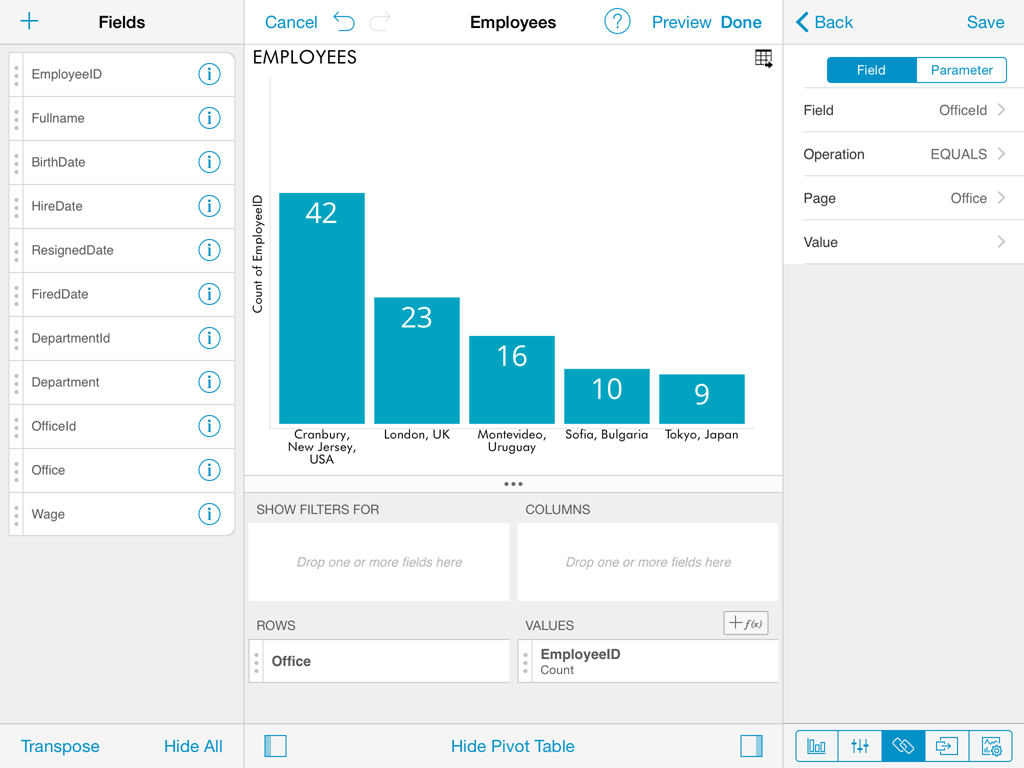
In both cases, the binding is defined by adding rules that link a field in the global filter data set with a corresponding field in the widget's data set, we call this field binding.
Field Binding
Field binding allows you to configure a join relationship between the global filter dataset schema, and the widget's dataset schema. To do this, tap the + button which displays the field binding dialog.
In this dialog you must configure:
- Field. This represents the column in the widget's dataset that will be used as key to join with the global filter dataset. For instance: EmployeeId, ProductId, DepartmentId, etc.
- Operation The join operation to use, which can be one of the following:
- EQUALS. Requires that both the field value, and the global filter selection be equal.
- CONTAINS. Meant to be used with fields of type String, enables to join when the field value contains the global filter selection. For instance: Field value='FRANCE' CONTAINS Page selection='FRA'.
- BETWEEN. Only available when the configured field is of type Date, meant to be used with the Date Rane global filter.
- global filter. The specific global filter form the global filters list that will be joined.
- Value. The column to participate in the join on behalf of the global filter dataset.
Parameter Binding
The data sets used in the creation of a dashboard may have parameters depending on the data source they were retrieved form. For instance, if an Excel spreadsheet is dropped in the dashboard canvas, then it will have as parameters the Sheet Name used, and the range of cells within than sheet. On the other hand data sources such as Reporting Services reports have their own parameters which are defined as part of the report definition.
Global Filters allow to modify these parameters dynamically depending on the value selection in the global filter. This can be used for instance to target different sheets within one same Excel spreadsheet. On ocassions Excel spreadsheets have different sheets with the same structure of data, but with different dimensions of analysis, such as different months, or different clients, etc. Parameter binding enables to switch the Excel sheet used, or the parameter sent to the server with a simple tap in the global filters list.
In order to configure Parameter binding, you must select the Parameter option in the segmented control on top of the field binding dialog. This will bound the selected global filter to the parameter of the widget data set.
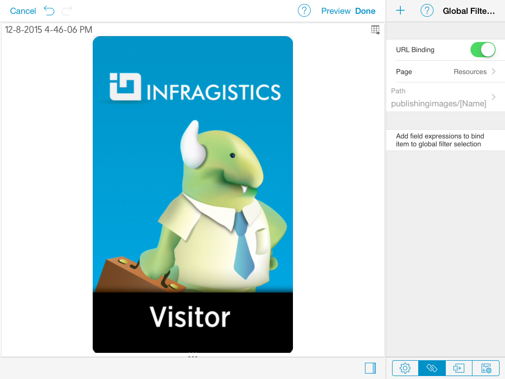
URL Binding
For some data sources there"e;s another type of binding available, called URL binding, which allows to link global filters to data sets or assets that can be retrieved with a URL, such as in SharePoint, OData, and Web Resources.
If this is the case then a different configuration option is made available in the Binding Pane. You are able to turn on URL Binding, and define a URL Binding Path expression.
This feature enables the report to query different items dynamically from the data source, depending on the global filter selection. This matching is based on a dynamic path and not on field rules between the datasets.
For instance, the tasks list of a SharePoint Project site could be retrieved with an expression as follows:
/projects/[ProjectName]/Tasks
Where ProjectName is the name of a column in the global filters dataset.
The URL Binding Path editor requires the selection of the global filter to bind to, and provides the following assistance,
- It provides the base static URL to act as starting point.
- With tap and hold the user is able to select from a list the column names in the global filters dataset .
Date Range global filter
ReportPlus supports enabling a range of dates as global filters to bind to from widgets. This enables time based analysis scenarios, changing one data range and filtering the whole dashboard.
In order to enable the date range in the global filters section you must tap in the upper placeholder of the global filters pane.
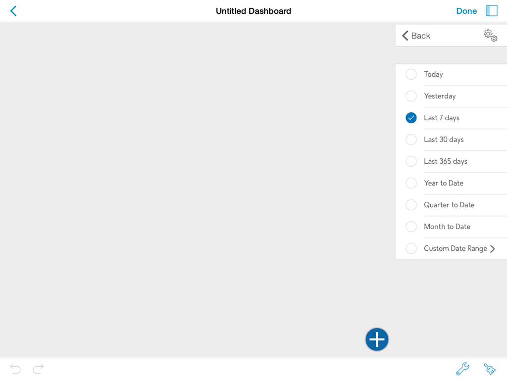
The initial date range selected is the last seven days. Once the date global filter is enabled it becomes available to be used in field binding expressions.
Displayed Column
Selects the column within the current data set that will be used to display values in the Global Filter. Listed values will not repeat even if they appear multiple times in the data set.
Multiple Selection
ReportPlus supports the selection of multiple global filter values simultaneously. This is meant to enable side by side comparison between different elements in a collection. For instance in the Countries dashboard you can compare the GDP of different countries by enabling multiple selection.
In order to enable multiple selection you must switch the dashboard to the Edit mode. Once you do this the global filters pane displays a button with gears as icon. If you tap it you access the global filters settings, which allows you to turn on the Multiple Selection mode for a specific global filter dataset.
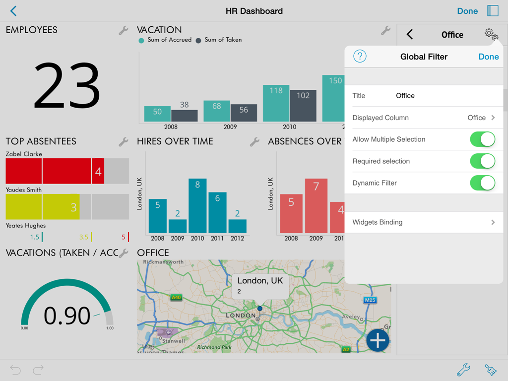
Required selection
global filters can be configured to require a selected option, or to allow no selection. By default a selection is required. Making selection optional allows the user to tap on the selected row unselecting it, which removes the filter on the query performed. The query retrieves all data from the data source and No selection is displayed in the global filters row. Sometimes this may not be desirable, for instance for user experience implications, if all the charts are cluttered with tens of data series the data becomes hard to read. It's up to the dashboard author to determine what's the best option.
Dynamic Filter
Enabling Dynamic Filter on a data set dropped in Global Filters enforces a cascading filters behavior on the list of displayed values in Global Filters. Whenever the same data set is dropped more than once. The second filter will honor the selection in the first one, and show a list of values already filtered by the current selection. For instance, if a data set is dropped containing both Countries, and Cities, and the first filter is used to display "Country" as the Displayed Column, and then the field "City" is dropped second the list of shown cities will be filtered by the current country selection.
Disabling this option forces to display all existing values in the data set for the displayed column. If the data set is used a third time, it will honor the selection in the second filter, despite the Dynamic Filter configuration of the second filter.
AutoPlay
In Dashboard view mode the global filters pane displays a Play icon on top, which if pressed starts a slideshow automatically changing the values of the selected global filter, with a delay of 5 seconds in each global filter.
Dashboard Global Variables
With Dashboard Variables ReportPlus brings to the table the what-if analysis or sensitivity analysis. This type of analysis is commonly used to determine how different values of one external variable will impact other dependent variables in a given scenario.
ReportPlus-related examples are:
- A dashboard with forecast analysis that includes a variable with the interest rate value.
- Dashboard about profit margin of a new product, with fixed and variable costs.
- A dashboard about sales projections that ultimately depend on a specific large deal with a big company or the exchange rate used at the time of a transaction.
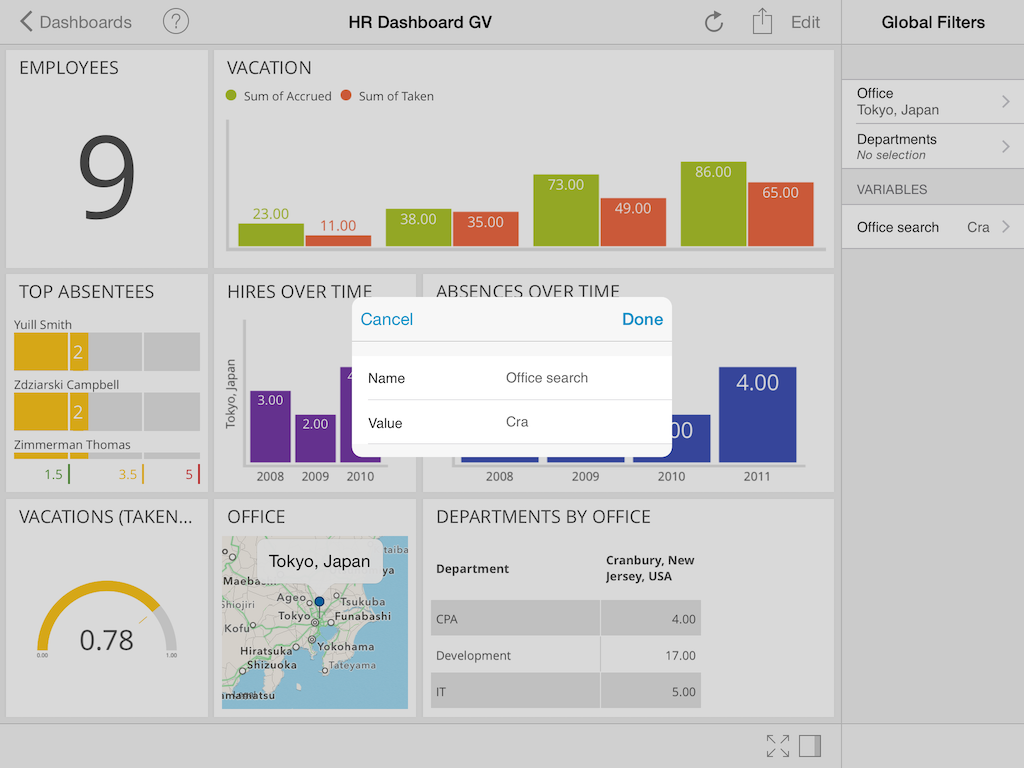
Creating Dashboard Variables
To create a new dashboard variable in Edit mode, just go to the dashboard canvas and tap the Variables placeholder below Global Filters. Then, give the dashboard variable a name, data type, and value.
Using Dashboard Variables
Dashboard Variables referenced in widgets work like Global Filters and can be changed dynamically while you are browsing the dashboard. But unlike Global Filters, they are not restricted to a set of predefined values and can instead take any value you enter.
A particular widget can reference Dashboard Variables through calculated fields and widget binding.
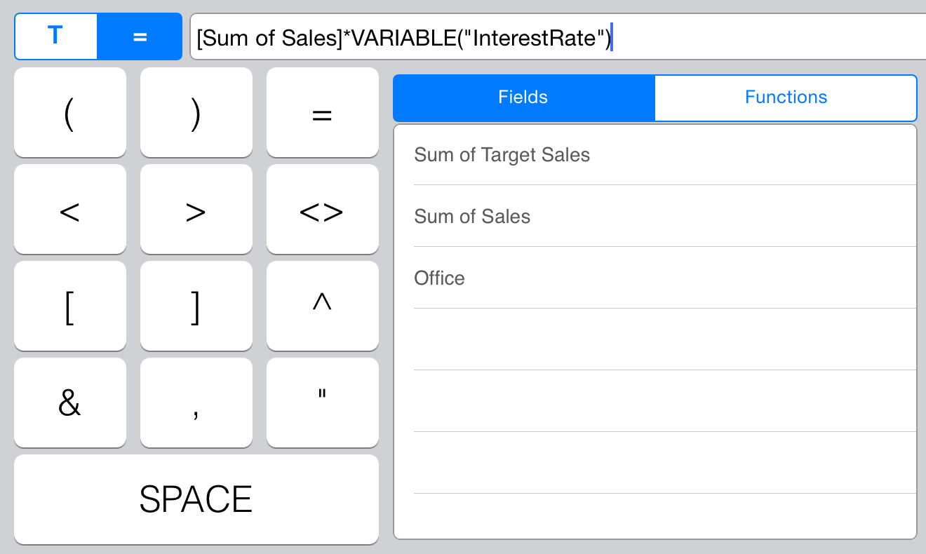
Calculated fields
When working with calculated fields, you can reference a dashboard variable using a new function (VARIABLE). This function receives a text parameter with the name of the referenced dashboard variable.
Widget binding
Once a dashboard has at least one dashboard variable created, a new data set is made available for widget binding. The new data set (Global Variables) contains a field for every dashboard variable.
Export Options
The information displayed in dashboards will change over time as the data changes in the data source, but there will be scenarios where you will profit from sharing a snapshot of the data in that specific moment in time. For instance to highlight an unexpected value, that may provide some business insight and requires attention right away. Also the dashboard format which allows to pack a lot of information in a single view may not be the best format to provide a more detailed, and corporate branded, walk through and discussion around the information upon sharing. For these cases ReportPlus provides the ability to generate a branded document with a snapshot of the current state of the dashboard's widgets, annotate it, and email it. In this way you can share any conclusion, or insight derived from the data in an easy way to understand for anyone in the company, and also to serve as report to be stored over time. In order to access the export feature you must navigate to the dashboard actions menu.
Supported export formats are the following:
- PowerPoint Slide Deck. A capture of the dashboard widgets as a collection of annotated slides. Suitable for presenting the information to groups of people, one slide at a time.
- PDF Document. A read only PDF document, that generates one page for each widget's capture, and corresponding annotations.
- Word Document. A Microsoft Word document, with a similar structure as the PDF export, but which enables collaboration with other team mates to keep evolving the document with changes.
- CSV Files. A zip file with a collection of CSV (Comma Separated Values) files containing the information displayed in each widget in a raw format. Suitable for sharing only the data retrieved by ReportPlus from the data sources.

Export Settings
ReportPlus allows to configure a set of export settings which allow you to customize the generated document to better suit your needs. You can access these options through the Export Settings button on the right side of the top bar.
From this dialog you can configure the following settings:
- Author Names. Name that will be used in the generation of the report as author of the document. This entry is optional.
- Company Name. Name of the company that will be used in the document if the Company Logo is empty. This entry is optional.
- Company Color. The color that the brand is most identified with. It's used to brand the generated document. You can select it with the color palette by tapping the colored square, or by entering the RGB hexadecimal format.
- Company Logo. .
- Max Number of Columns. Whenever a widget with a grid visualization is exported ReportPlus will generate a table. By default only the first 8 columns are displayed, to make sure the information is not crammed and remains readable. You can tailor this figure if you want more or less columns displayed for grid visualizations.
- Max Number of Rows. This setting allows to customize the number of rows that are exported for widgets with grid visualizations up to a maximum of 200.
Export Scope

Dashboards with Global Filters will display the export scope dialog, which allows you to choose between the following two export types:
- Current Values.The export generation takes place as if there were no Global Filters defined. Generating one page per widget with the current values, given the current filters selection.
- Multiple Filter Values. ReportPlus will traverse the first data set defined in Global Filters, and for each of the selected values it will generate a different page.
Report Pages
This step in the export process is meant to allow you to select which widgets, or global filter values, are going to be used in the export process.

If the dashboard has global filters defined, and the export scope selection is multiple values, then for each global filter value a row will be displayed in a list. Otherwise the list contains one row for each widget. From this list you can select which elements are to be included in the generated document by switching the Visible control contained in each row. No more that 50 elements can be included in the export.
Tapping on the pages rows prompts the page detail view, which allows you to change the title, add text notes to a page, and annotate the captured image.
Annotating Images
Once you access the image annotation mode, you will see a top toolbar with two options. The first one allows you to add shapes, and free style annotations.

The second top level option allows you to add text on top of the image. It provides options to customize the entered text, such as: border colors (foreground, background), font family, font size, and font color.

Once you are done with annotating the image, you must tap the Save button on the top right corner, and then if you want to commit the changes the Done button.
Sharing the exported Report
Once you have edited title, and description, and annotated the pages you can preview the exported document with the preview button on top.

Finally you can email, print, or send the document to a third party app either by tapping the actions button on the preview screen, or in the last export step, in the Export Options dialog.

Multiple Data Sources
You can combine data from multiple data sources into one data set by creating a Multiple Data Sources connection. This enables mashing up data from different enterprise systems to analyze it and chart it side by side in the same dashboard widget. For instance you may compare web site visits over time retrieved from Google Analytics, with sales figures coming from an enterprise ERP system to gain insight about the correlation of these two variables.

Once a new Multiple Data Sources element has been created it can be used as any data set in ReportPlus. By dropping it in the dashboard canvas it can be used to create dashboards. It also remains listed under the Multiple Data Sources item of the data sources catalog, right below the Local Files folder, allowing it to be reused in different dashboards.

How to create connections to Multiple Data Sources
Connections to Multiple Data Sources can be created in two ways. The first one is by tapping the + button on the data sources pane, and by selecting the Multiple Data Sources option located at the bottom of the dialog.
The second one, and most straightforward way, is by turning on the Multiple Data Sources button on the top bar of the dashboard, and selecting two widgets. This will prompt the same dialog, but with most options preloaded.

In order to create a new Multiple Data Sources connection you have to configure the following:
- Name. Name of the new combined data source.
- Data sets to combine. You must browse the existing data sources and select two data sets to combine. For instance, Employees and Offices.
- Join condition. The equality condition that needs to match for two rows to be joined. For instance Employees.OfficeId = Offices.OfficeId.
- Selected Fields. Fields to carry over to the combined data set.

Data sets to combine
The definition of a Multiple Data Sources connection requires that you configure two data sources to merge. If you need to combine more than two you can generate a first connection with two, and later add another Multiple Data Sources connection combining the first one created.
Once you browse and select a data set you can configure filters, pivot table summarizations, or add calculated fields.

Calculated Fields for instance gives a good degree of flexibility when joining two data sets, as they allow to make adjustments and apply transformations to field values to suit them better to the join condition.
Once configured a data source, if you want to erase it you must swipe the row from right to left and a red Delete button will be displayed. Tapping it will remove the data set.

Join condition
The join condition dialog allows you to configure two things. The equality condition needed to link rows of different data sets, and the criteria of what to do when the condition is not met.
For instance, given the following data sets, joined with the following condition: B=B'
Left
|
Right
|
The criteria definition allows the following type of behaviors for the join operation:
| Discard all non matching rows |

|
| ||||||||||||||||||
| Include all left |

|
| ||||||||||||||||||
| Include all right |

|
| ||||||||||||||||||
| Keep all on both sides |

|
|
It's possible by adding a calculated field to create a column containing all values of B and B'. Adding a calculated field named B+ with condition: IF(ISEMPTY([B]),[B'],[B]) allows charting using the B+ column in the x axis. For instance to chart metrics over time, using Date columns with different names. For the proposed example this would generate the following data set:
| B+ | A | B | B' | C |
|---|---|---|---|---|
| b1 | a1 | b1 | b1 | c1 |
| b2 | a2 | b2 | ||
| b3 | b3 | c3 |
You can remove a condition in the same way you delete data sources, by swiping from right to left on the condition row.
Combine by tapping widgets in the dashboard
Once the Multiple Data Sources icon is tapped the dashboard canvas enters selection mode, allowing you to select any two widgets to combine them.

As soon as you tap the second widget the Multiple Data Sources dialog is prompted with the name, data sources, and possibly join condition preloaded.

ReportPlus attempts to determine automatically the join condition given the two selected data sets. To do this it takes into account the configuration of the visualization type, the pivot table configuration (if any), and the name and type of the fields to find matches. If ReportPlus doesn't find a probable join condition to load automatically it falls on the user to define the join criteria. In this case the dialog jumps directly to the join condition dialog to speed up the process.
In some scenarios, when merging charts or pivots with compatible field types, ReportPlus will automatically generate a calculated field containing the union of the two fields participating in the join condition to facilitate the analysis process. For instance when analyzing metrics over time, if the join is based on the Date fields, ReportPlus will generate a new Date field to allow charting metrics coming from the different data sets over time as well.
Once all the required fields are entered in the dialog you must tap the Save button. This will create a new widget in the dashboard canvas with the merged data set ready to be used in the dashboard creation. ReportPlus will try to honor the existing visualizations used in the selected widgets.

Navigation Between Dashboard
ReportPlus supports the navigation between dashboards triggered by specific events, such as: maximizing a widget, or tapping on a grid row, or chart column/bar. This feature takes the concept of drill down navigation to a new level, for instance if you want to provide more detail on the information displayed in a widget you can use a whole new dashboard to do so. This can be very useful to establish top down analysis paths, where you go from a high level overview of the reality of a business to more detailed views with the specifics.
One example is the implementation of a Company 360 dashboard, which provide key performance indicators for each area, and once you tap any of the widgets to maximize it, ReportPlus opens another dashboard with more detail for the selected department.
It's possible to associate actions to specific events. Opening another dashboard is one of two supported actions. The second one is opening a url. This enables extensibility scenarios such as interacting with third party web applications as part of the dashboard navigation.
In order to configure this feature you must select the actions tab in the Widget Editor, which displays the following configuration dialog:

Events
The control on top of this dialog selects the event, or trigger that will be used to fire the action. Possible options are:
- Row Tap. This event is triggered whenever a user taps on a row in a grid view, however in other visualization methods such as charts it's triggered when a user taps on a data item of the chart, such as column, or bar, depending on the chart type. On custom visualizations this event can be fired through the API.
- Maximize. This event is triggered whenever the user maximizes a widget in the dashboard view.
Actions
Possible actions when an event is fired are:
- Open Dashboard. Enabling this action, will open another dashboard when the selected event takes place. If the selected dashboard happens to have global filters you will have to configure how to populate it for each global filter. Available options are:
- Column. Get the value from on of the columns of selected row.
- Literal. Manually enter a fixed value.
- Global Filter. Get the required value from one of the global filters of the starting dashboard.

- Open Url. Enabling this action will open the configured URL in the device's browser.
Import Spreadsheets
ReportPlus supports importing Excel (.xlsx, xls) or CSV files to be used as data source in the creation of dashboards. The options to import spreadsheets are the following:
- Send the file from another iOS application
- Load it with iTunes File Sharing
- Configure a connection to a content repository & save locally
Sending the file from another iOS application
The iOS platform allows to share files between apps. One good example of this is the email client app, which allows by tap and holding attachment files to send them to other applications. If you tap and hold an email attachment a popover displays all the apps that support receiving that type of file.
ReportPlus supports incoming files of types: .xls,.xlsx and .csv, among others. When a file is sent to ReportPlus the application starts, and the received file is stored in the Local Files folder. If the file already exists the user may choose to overwrite it.

This option enables some key business scenarios, such as:
- Using ReportPlus with spreadsheets received by email.
- Creating spreadsheets in the device, in any third party application such as Numbers, or Documents To Go, and then sending that file to ReportPlus to use to build a dashboard. Sending a spreadsheet from Numbers can be achieved with the Share and Print>Open in Another app> Excel>Choose App>ReportPlus option.

Load it with iTunes File Sharing
iTunes provides a File Sharing feature, that allows to copy files to ReportPlus's storage directly. For a more detailed explanation of iTunes File Sharing you may check this article.
In order to copy files you must plug the device to your laptop/desktop, go to the apps section, and to the File Sharing dialog at the bottom of that screen. Copying is achieved by dropping files in the documents list. Files copied in this way will appear available in the Local Files folder of ReportPlus.

Configure a connection to a content repository & save locally
When possible it's best to configure a connection to a shared file content repository, such as SharePoint, Dropbox, or Google Drive. Once a connection has been configured, files available in these repositories can be added to the dashboard directly, in which case the dashboard will keep a reference to the file, and it will reflect changes if the file is modified.
If for whatever reason, you want to carry this file with you there's always the option to copy the file from the content repository to Local Files. This ensures availability of the file in offline scenarios, or even the chance to create new dashboards with the local copy. In the iPad copying is achieved by dragging files to the folder with the disk drive icon in the bottom toolbar. In iPhone just select the file, and then tap the corresponding icon
Configuration Settings
This document describes the configuration options available in ReportPlus, which can be divided in application (or general) settings, dashboard settings, and widget settings.
General Settings
General settings affect the application's behavior for all your dashboards. They can be accessed by tapping the button with the gears icon in the initial view.
The available configuration options in General Settings are:
- Offline Mode. Enable the offline mode to tell ReportPlus that data sources cannot be accessed in the current network environment, so it spares the attempt to connect with them, forcing the application to rely only on the cached data. This means that the spinning wheels (activity indicator animation) will not be displayed when opening a dashboard. It's useful for demos or presentation environments where quick access is critical.
- Disable Auto-Lock. This setting prevents the device from locking itself while you are using ReportPlus
- Manage Accounts. Centralized access and management of all the accounts you need for your data sources.
- Default Formatting Settings. Here you can configure the default formatting settings for all your dashboards, like date format and the currency symbol.
- Recycle Bin. Here you can find the deleted dashboards and you are able to restore them.
- Reset Cache The Reset Cache option forces the deletion of all cached contents, for all dashboards. Note that when applying this option while offline, some dashboards may not be displayed. Dashboards that rely on external data sources (not in Local Files) will be unable to retrieve their data.
Dashboard Settings
These settings affect the behavior of the current dashboard only. They can be accessed in Edit Mode, by tapping the button with the gears icon in the initial view and then Settings.
The available configuration options in Dashboard Settings are:
- Dashboard Title. Short text used to identify the dashboard, also displayed in the initial view.
- Dashboard Description. Long text that states the purpose of the dashboard. It's used when exporting the dashboard to a slideshow.
- Layout Settings. This section governs the matrix used to lay out the blocks or widgets of a dashboard.
- Preset Layouts. Provides a set of pre-configured layouts for a quick start.
- Columns. Set the number of columns for the dashboard's matrix, ranges from 1 to 5.
- Rows. Set the number of rows for the dashboard's matrix, ranges from 1 to 4.
- Style Settings. This section governs the aesthetics configuration of a dashboard, allowing to change background & foreground colors, and enabling a background image for the whole dashboard.
- Password. This section enables a passcode lock for the dashboard, blocking editing capabilities and only allowing users to navigate the locked dashboard.
- Change Data Sources. This option prompts a wizard to guide you while connecting the dashboard to a schema compatible data source.
Widget General Settings
The available configuration options in a widget's General Settings are:
- Title. Short text used to describe the contents of a widget in the dashboard.
- Last Update. Last time data was retrieved from the widget's data source. Tap the refresh button on the dashboard canvas to update.
- Show Title. Display or hide the widget's title bar.
- Expiration. Time to live of the data retrieved from the data source. By default, data from the local cache (that has not expired) will be used instead of querying the data source.
- Enable Preview Mode. This option was introduced to work with large data sets. Once enabled, ReportPlus will prioritize performance and the amount of data retrieved in design time will be trimmed. Out of the widget editor, the complete set of data will be always displayed.
The following are the available data source settings, in the widget General Settings, they are meant to be informative, and read only.
- Name. Name of the data set retrieved from the data source. For instance if the data source is a database it will display the name of the table or view the data is coming from. This is informative, and read only.
- Path. Path in the data source to the data set used by the widget. For instance if the data set comes from a SharePoint connection this option will display the route in the server to the list, or the document within a document library.